Thursday, 26 November 2015

Film certificate ratings


We analysed film ratings so that we could promote our film towards the most effective audience and designated niche market. Typically horrors are not governed towards any ideal audience under the age of 15. however, the woman in black stands as an exception because it is a historical classic novel that was deemed acceptable by the BBFC in addition to the horror based film 'the hole'. 'The Hole' was accepted as a twelve rating predominantly because of the usage of young upcoming actors featuring in CBBC and CITV programs. We considered making our film a 12 because we wanted the opening to focus on an effective inventive story-line and plot rather than just aspects of horror and scary or gory scenes. If there was actually a moral behind our story it could be classified as a 12 and therfore appeal to a wider and more broadly aged audience..this means we could still include  jump scares and possibly disturbing scenes without the usage of strong gore and death. Usually most 12 films are action movies or thrillers, so our movie would be distinctive and we would have to argue our reasons for allowing a horror based thriller to be a 12 certificate. The BBFC state that some horrors may be passed under the 12/12A category with moderate physical and psychological threat permitted along as horror scenes are infrequent with an overall tone that isn't disturbing and infrequent swearing or taboo language or nudity. Also, twelve rated films cannot involve harsh incorrect drug usage or promotion-which our film wouldn't. We were thinking of having a focus in our film on alcohol abuse with a driver involved who acts as if he had been heavily drinking, however we haven't confirmed this idea and need to further work on the age rating for this type of alcoholism.

The most obvious choice for a horror film rating is to aim it at a 15+ audience because this would appeal to teenagers who enjoy the idea of being scared and going to the cinema as a planned event to watch a horror movie. Also a 15+ audience would be more mature and therefore the story-line could touch on different more adult topics. film examiners look at issues when rating a film such as discrimination, drugs, horror themes, imitable behavior, language, nudity, sex and sexual violence and theme. The idea of imitable behavior is a subject to be carefully considered when creating our film because any ideas of danger or violence need to be considered as to what audience we are portraying this to, especially with our idea of the inclusion of roadside issues and reckless driving. Films are also considered under context, tone and impact of how it may make an audience feel; there is also the consideration of the release format- for example if it is released on DVD is there a higher risk of underage viewing. 15 films accept racist, homophobic and discriminatory language as well as strong taboo words and even the strongest language terms like f**k and c**t (depending on manner of use). 15 films are also allowed to include lengthy sexual activity and nudity in a sexual context without strong detail. 15 films also allow strong violence however no dwelling on the infliction of pain or injury, strong sadistic violence is however unacceptable and continually gory films are rated 18s. 15 films allow detailed verbal references to sexual violence for example descriptions of rape or sexual assault in a courtroom scene or in testimony however depiction of sexual violence is not allowed or must alternatively be completely justified in context of the story-line of the film. We know that our horror wouldn't break any of the 15 rating boundaries because there can be strong threat and dark horror as long as there is not a sustained focus on sadistic and sexualised horror and threat- which wouldn't be flaunted at all in our film.

i wanted to research how 18 films differed so wildly from the 15 rating and why you need to be within adulthood for watching 18 movies. when i analysed the film rating, it realized that it was because of inclusions of very strong violence, strong and frequent language, strong horror and sexual activity as well as sexual violence, blood and gore and discriminatory language and behavior. at 18 there is no themes prohibited and adults are free to choose their own entertainment providing the material is not illegal or harmful- this means that this particular categorization for film ratings can even be offensive to adult viewers. Although adults can watch what they want- there is potential aspects that could be cut from an 18 movie if there is material that breaches the criminal law or where material has very detailed portrayal of illegal drug use and sexual and strong violence for example making rape look appealing. Rating a film an 18 cuts out 25% of movie goers as 15% are aged 2-11 and 10% 12-17. This means that by making our movie a 15 we would have a wider audience to promote our film to, as teenagers make up a wide population (at least 8% are 15) and would create more of a broad viewing population & income.


Thursday, 19 November 2015

Horror movie analysis- Drag me to hell

CLIP IS AT: https://www.youtube.com/watch?v=-xPYHygck6o

I chose to analyse the opening sequence for 'Drag me to hell' because the film is a successful  blockbuster that grossed over $90 million worldwide as well as winning the award for best horror movie in 2009 at the scream awards and the 2010 Saturn awards. This reinforced the success of the movie and made it evident that i should use this particular horror as inspiration for my own, as i want to make my horror movie opening engrossing and successful. The directors, The Raimi brothers wrote and directed the movie and Ivan Raimi also worked on the spider man films- i thought this showed a prominent interrelation between action and horror. 
The movie opens with an establishing shot of the location. Horror movies typically don't begin by jumping straight into the action or plot- instead we meet our protagonist or begin to relate to characters. Typically 'normal' home environments, relationships and friendships are depicted. however, here although the audience may presume we are to be entering the internal environment of a picturesque looking mansion building with palm trees flaunting the exotic location and the broad daylight suggesting nothing can scare the audience as of yet......the audience are wrong. The establishing shot of this seemingly pleasant and quiet residence creates a huge contrast with what actually is about to happen there- and the plot starts rolling straight away without any distractions or even getting to know characters. The establishing shot is effective to have right at the beginning much like many movies to show where the action is about to take place...other movies i have researched either use this same technique or completely contrasting- use the technique of a close up or extreme close up to begin a movie so the audience either learn and appreciate the location, or are led to uncover what and where the movie begins. The daylight usage in this movie is effective because usually artificial lighting is brighter than outside at this time of day- however here, the outside seems more pleasant, naturally lit and light, than the darkness of the internal house where the dark happenings proceed. The way the house is framed in the shot by trees possibly suggests the area is more rural, and nobody is near or able to help with anything that goes on. This rural setting of a horror movie is a common convention of the genre- in movies like scream, the hills have eyes, the strangers and many more- the going-ons that proceed in the house are so far from anyone else or any urban areas so nobody is able to help, rescue or 'hear the screams'. The establishing shot remains still for a few seconds and then the camera moves downwards. the soundtrack accompanying the shot is a soft melodic theme, sounding almost like woodwind instruments. this reinforces the weather conditions at the location, because the leaves rustling slightly suggest it is windy too. The Rendition could possibly be seen as a ghostly sound, and it is quite quiet in comparison with the sounds in forthcoming scenes. The Drag Me To Hell soundtrack was actually composed by an artist named Christopher Young- who has worked with the directors of the film previously so had a close relationship and understanding of his composition. Young said that emphasis was on 'using the soundtrack to create a world that didn't exist', a world of the supernatural. this means the score contains lots of un-natural, not in sync slow high pitched sounds to create an uneasy feeling. There is a particular usage in the movie of childlike soprano vocals that have a prominent part in the soundtrack...i thought this was an effective idea to inspire my own movie soundtrack as often children's ghostly voices can create a chilling feel. In the first few seconds, as well as the audience being aware of the location, the caption in the right handed bottom third of the screen tells us the film is set in California 1969. This creates a relevant contextual meaning to the film, and the audience may bring in their own knowledge of the witch hunts and conspiracy in old-time america which have a relevance in the film. also, the date makes it evident that this is either a flash back that will have a further meaning to the rest of the film-or that simply the film has a historical basis- much like films like the woman in black. Once again- i was inspired by this idea of setting movies in the past, because the past is not always 100% factual and known....events can be interpreted in many alternative ways and it is easier to create a plot based in old times and support it with roughly relevant history to make the entire plot seem more belivable and withholding some aspect of truth.
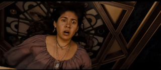
when we are deflected away from the initial establishing shot, we meet a small family who are pictured to be panicking and scared and immediately attention from the audience is grabbed from the start as we want to know what has happened to the boy. The soundtrack seems to differentiate slightly from a quiet woodwind rendition to the voices of child sopranos (as previously mentioned) which obtains more of a link with our young child character. A tracking shot follows the mother as she runs to the door, in a fast paced motion and we focus on her old fashioned clothing which appears poor and peasant like- immediately feeling slight sympathy for her. the dull colors of her clothing makes her seem un-necessary; possibly foreshadowing the fact we don't actually see her character again after the opening two minutes. The fact that the characters speak in another language shows how times have changed, because although this is set in america- there is an alternative native language to simply 'American'. The different language with sub titles creates suspense and mystery because we do not understand straight away what they are saying. In the shot that i have pictured above, i thought it was effective how the shot is from a eye level angle, however the levels in the scene enable the witchcraft character to be seen as more important and higher up than the family. She therefore, has prevalence in the scene. Shot reverse shots are used to rebound from the Witchcraft woman to the family and back and forth. this allows the audience to feel involved in the conversation. After this shot- we receive an extreme close up of the silver necklace the boy stole, that is the potential cause of the curse he has. such a close up shot reinforces the possible importance of the necklace, and even minor details like the fly that was near the necklace are noticed. The usage of this particular prop means that although there is no antagonist- we see the necklace as a thing of evil- meaning there is possibly a antagonistic character yet to meet. It is often hard for evil to be portrayed through the usage of an actor because sometimes people in horror movies alone cannot be scary without any supernatural appearances or abilities...so it is easier to create an enigma or the idea of an unknown presence using props like relics and antiques that define evil until we finally meet the root of it.

 After the witchcraft woman says 'bring him inside' we immediately  cut to the boy on a floor inside the house with the filming of how he got inside and to be laying on the floor completely omitted through the use of ellipsis so that the film cuts straight to relevant information that the audience will actually be interested in enabling the plot to follow on and flow freely with only the most relevant of shots and information included. the close up that we receive here of the boys face is close up and framing his expression as he appears terrified and distressed...we can see from the use of makeup in the movie that he is sweating and quite possibly ill and in a bad state. Without having the inclusion of dialogue- this sweat already suggests there is a sense of panic and fear, and sweating in negative situations is something most people can relate to. The way that half the boys face is covered by a blanket- shadowed, whilst the other half reflects the light off his face may possibly suggest a split persona....he stole a silver necklace and is therefore a thief, however he is sorry and youthful suggesting he should not be punished.Alongside the prior soundtrack, there is sounds of heavy breaths and groans alongside the music, as well as the short sharp panicked diegetic sound of the boys breathing. we do not know yet if the harsh heavy breathing the boy hears is a diegetic sound or not- or merely just in his head....however it is still a chilling sound for the audience. The camera cuts to an eye-line match of
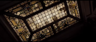
what the boy can see above him- a light window with the shadows of many hands overlaying it. The camera films this in a particular way to make it seem even more uneasy so canted angles are used as the camera tilts and slowly spins almost as if the boy is drifting off to another darker place- hell, or that he is caught among a cyclic daze- causing him to almost hallucinate. The spinning in the scene suggests dizziness and the way that the light is used so we can only see the window highlighting the dark shadow hands makes the audience unaware and scared about what else lingers outside and even near the window. Shot reverse shots of the boy then the window, then the boy again create a prominent link between both shots...whether this is relational editing and both are unsettling sights or both breathing heavily, or just editing to show us exactly what the young boy is seeing. A Foley artist most probably created the non diegetic screeching sounds used in the scene and it almost sounds as if a door is opening- foreshadowing the under world opening up to take the boy in the next minute of the scene. the sounds are almost painful to listeners and create an experience that involves the audience more.The surroundings around the boy are dark, as if he is in a night-time shadowed, dark environment, however lighting still enabled the audience to see the sweat and panic reflecting off his face. For my own movie, being a horror- i wanted to use darkness and night-time environments, so i need to focus on using effective lighting just like this so that it still appeared realistic and dark.....this is why to the right- i have included a video tutorial i watched to help with lighting techniques and filming methods for shooting in the darkness.

It is effective that at 1;22 there is a shot of the mothers hands embracing her sons as there is a clear contrast here between the shadowy, almost fantasy hands highlighted in ceiling window, and the real raw hands of the mother. The hand imagery creates an important relationship and link and hands can be connoted with grabbing, taking, holding, grasping and hanging onto...and we can see that the boy is hanging onto life whilst hell is attempting to take him. The close up that frames this loving body language enforces this effect...however we see the hands of hell from a low angle, looking up on them showing their domineering power, however the mothers hands are looked down on from a high angle- reinforcing how feeble and powerless they are. A few seconds later, the woman displays an expression of recognition and we see her look to the side as an eye line match shot confirms what she is looking at-the witchcraft woman. At 1;34 the doors blast open from an invisible force, and the effect of this plays a role in scaring the actual external audience more than the characters, who have worse to come. At this point, camera editing techniques have played a role in almost warping the appearance of the strewn doors as if the force from hell has the power to do anything. Doors typically break and splinter if hit hardly, not bend- so this reinforces the supernatural basis of the film and rather unreal scenes. At this point- a loud definite sound effect accompanies one of the loudest and lowest pitched droning parts of the opening scene, making its prominence more noticeable. The loud pitched diegetic scream the boy makes is a typical convention of horror movies having such a high pitched chilling scream, especially being from a child makes the audience feel pity for the state of the young child even more. The close up shot used here frames his terrified expression as he screams. The long shots of the havoc in the room where the family are shows the adverse external effect of the boys curse, and the wind in the inside homely environment is almost showing how nature has power, and plays on pathetic fallacy with the wind almost being like the breaths from the creatures of hell- exceptionally powerful. The usage of props such as windows and shutters being blown shows how this entire scene is completely un natural and atypical as usually the wind comes from outside not inside. Also, the shutters show how something that should be kept out and and not seen is completely playing against that idea.

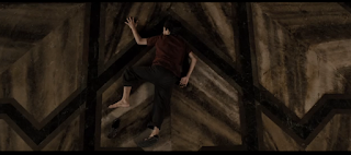
At 1;42 a match action shot that tracks the boy as he sprints away is used. the action is matched because we see the boy get off the floor and begin to run from a side view and a relatively long shot which then changes with a clean cut to a mid shot from behind him. The sound effects to accompany this are very clear and defined with no background or non diegetic noises and even the sound of the boys shouts are slightly muffled. We can hear, defined, as if right next to the camera- the sound of growling and grunting and the camera films as if it is handheld-filming from the perspective of another person or source. This could be considered a point of view shot as the boy repels the camera as if it is a force of person he has to resist. This shot could be considered ineffective because it is almost dissociating the audience from the boy because he wants to be away from the camera/point of view and therefore runs from it. At 1;47 another match action shot is used to film the boy as he is picked up and strewn onto the floor, we first see this action from a frontal view-eye-level- which then dis orientates the audience by filming from a behind and low angle view as we see the boy fall to the ground. This low angle is effective as it shows the height the boy has fallen from. effectively, the sound of growling that seemed close to the camera dissipates when the boy is filmed from another angle. The source of the noise- the antagonistic force- was what picked the boy up...and when the deed is done, we can no longer hear the noise. This shows the importance of sound usage in movies because we don't get to see the source of evil we only hear it so without sound we would have no idea what was there as the audience have no hints at the appearance of the creatures of hell until later on in the movie. By keeping the visuals of the horror characters secretive, an ongoing enigma has been created.

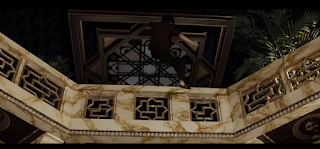
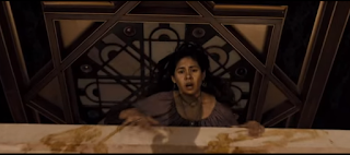
The camera tracks the woman as she leans over the balcony to look at the bottom floor and this tracking shot is fast paced to represent her panic, the camera tilts to a canted angle to show her leaning which is reinforced by the diegetic sound of fast paced breathing. breathing pays a prominent role in the opening two minutes of the film because although we would associate breathing with life-it can also be associated with the invisible antagonistic force and with panic and disorientation. we see an eye-line match as the woman sees the boy  below her and there is almost a plot twist as we see that this boy appears dead from his twisted body posture however seconds later it appears that he isn't. The camera without any prominent editing cuts straight back to the reaction of the parents when they see their son, and the mid shot frames the the reactions even more especially with the wind blowing back their hair so all that is framed is the emotion change. Having all three of them in the shot shows a difference in emotion-not just the cliche sadness....there is also confusion shown by the father and disorientation by the witchcraft female. The high pitched diegetic scream of the mother is not distorted or distracted by any other external diegetic or non diegetic sound.

As the boy awakens a shot looking down on him from a high angle, possibly belittling him or showing his small amount of power in the power that is to come is used which cuts to an eye level view shot closer up of him attempting to get up. alongside this, a score that builds in volume and pace begins to play- sounding almost synthetic as a backing soundtrack to the movie. When the woman shouts above him we see that the boy is almost confused at what is going on, and just as we do not fully understand her language, he does not fully understand his situation. The soundtrack is completely inaudible when  the floor cracks open and diegetic sound of it opening up is prominent.The camera at this point stays in a similar position, as if it cannot escape just as there is no way out for the boy. the use of lighting is interesting here because although the boy is to be taken to the dark hell ridden underworld, there is a fiery warm light seeping through. the light is warm because it looks like fire flares and it engulfs the area around the boy. we know this would not literally happen, so begin to recognize at this point that the film has a more supernatural mythical basis.

in the finale or climax of the ending part of the first scene, the boy gets dragged almost into the pits of hell. I thought it was clever how shadows were used to show the action, which would be a technique we could incorporate into our own movie as this would be easy to accomplish and special effects editing software wouldn't be required. Many of the other special effects in the movie were created using green screen, puppets, prosthetic's and CGI. The camera tracked up to see the woman's reaction, and the light from below illuminated her scared expression. Peter Deeming, one of the directors tried to use realistic lighting in the film...he said 'normally you'd put all color corrected bulbs in but we went with what was there including shots in the street as well as interior lighting' to in this way make the film itself seem even more realistic. The musical score for this part of the opening scene began to be more like the sound of an organ and was loud, a very low pitch and the sounds of childish screams or childish operatic noises accompanied the synchronous soundtrack. when the film ends with dialogue of 'we will meet again' in an archaic language, the audience is left in anticipation of when the woman returns in vengeance. there is a immediate cut from this to the title scene of the film with 'drag me to hell' in a chilling almost 'boney' looking font. this particular font inspired me for my own film because it seemed almost old and like a calligraphy font which fits more with the horror genre and how things that occur in the past have a higher potential to be scary.


Thursday, 12 November 2015

Film CREDITS analysis- Opening of World War Z

The credits begin with a piano rendition of 'isolated system' being played, with black backing screens contrasting with the bold titles. This contrast reinforces the boldness and importance of the titles, especially when the likes of Paramount pictures are being flaunted as in the film industry this is a huge and responsible name- already telling us that this film is going to be of a high standard and quality. The way that a well known alternative rock band song has been invented into a almost heavenly toned piano song is already a hint that this movie is atypical to the world now- and that this movie is set in the future, a dystopia. The first glimpse of actual imagery we receive is a establishing shot of a beach scene, the gentle piano rendition fits perfectly with the still shot of a peaceful beach, however with the type of dystiopian action film this is meant to be and quickening of the soundtrack pace we know this is not sustainable. we can hear the diegetic sound of the waves over the soundtrack making the scene seem prominent in comparison with forthcoming scenes where we are only given a visual. The cloud time lapse just after this camera shot is effective in showing what is below and what is above, giving the audience a sense of location with the effective usage of levels. Also, the fast moving clouds could foreshadow the typical action conventions of non stop cyclic happenings. Clouds are connoted with heaven, being at a high, prominent standard and lightness and freedom however this may just be a technique film makers have used to almost delude their audience into thinking this is set in a pleasant state. The next shot diverts from the light, tender beach colors and lighting and there is an establishing,although silhouetted shot of a cityscape- once again using these high up levels to reinforce power and what is above society. The sun, central of the screen here is possibly showing hope as light is typically a symbolic representation of positivity. Having a scene of a shanty town straight after this cityscape is effective and inventive because it has a heavy context basis around favelas and slums, often found just outside main cities and this looks very similar to the shanty town just outside Sao Paulo, Brazil. The image is blurred, however as a transition allows part of the image to be revealed almost through a prism it is as if the audience is uncovering key information. The next clip has the same shaped transition of the prior so the scene graphology matches, and we see a flock of birds fleeting away- which typically connotes something is coming- a change, whether it be an approaching danger or the weather. The actual shape of the Parallelogram that is a sharpened form of the film is almost like a hurricane or tornado shape- reinforcing how something bad could be approaching. This constant focus on the weather could have an ongoing link to pathetic fallacy where the weather is used unlike actual characters to represent emotion or feeling.

from 0;29 onward, we begin to see people- or more importantly- life. This is important because we firstly see people doing normal activities, walking, talking, embarking trains, cycling.....which completely contrasts with how we see later on in the movie introduction how there is a infection causing zombie like behavior. As we see life, we also hear the non diegetic narrative from TV news programmes, overlapped in a montage of different spoken news headlines, this suggests urgency and the formal received pronunciation accent makes it easy for the audience to straight away understand some of the key issues affecting this dystopia. After the human orientated clips, from 0:44 there begins to be a focus on animals, and through different editing techniques- entire establishing shots such as the bird ridden sky contrast with extreme close ups and less revealing, disclosed shots like the ant colony. All of these animals are shown in groups, reinforcing togetherness- and fighting an antagonistic force together. It also represents nature and how natural intentions and reflexes cause dependency upon others.


At 0;53 there is a short clip in the montage from the 'Oprah' integrating the theme of social media and the power of technology and celebrity over the public. this links into the way animals and humans have been portrayed in groups because celebrities like Oprah have huge influence and status- with large groups following her and a large amount of power. this almost foreshadows how only somebody with a status and power can be followed...and that people have to independently fight things (like the zombie/rabies disease in the film). The way that the camera shot almost seems like a re-used clip from Oprah's show suggests how there is global involvement, it also makes this montage at the start of the film seem more informative as we are receiving information from a key TV personality. the quality of the filming is almost 'grainy' as if we are not seeing the full quality or picture however the mid shot used to frame Oprah is purposeful to ensure we notice who she is. 


0;56 is one of the most prominent inclusions in the montage because it is the first time the sound becomes diegetic and matches the narrative with the imagery- almost as if it is a full clip extracted from a news broadcasting company,infact in this case-HLN news. We hear a urgent voice inform the audience about stranded dolphins, which reinforces ideas of purpose being to inform because informing is the key convention of news channels. The banners and graphology techniques displayed on screen almost make the clip seem interactive, as if we the audience can do something about it- or more, act as a warning for our future. Alongside the narrative, the clip of stranded dolphins is upsetting and is a long shot showing the beach location as well as the animals. After the beach scenes we had seen previously in this pre-film montage...it is evident there is a clear contrast in how we feel about the beach as an audience and the inclusion of both contrasting clips could be a representation of how things are so easily subjective to change- as we know our environment is currently with huge issues of global warming etc. The usage of natural daylight in this shot reinforces how nothing is hidden or in the shadows and typically a slaughter of humans would be seen as a dark shady crime, however the death of these animals seems almost casual, obvious and prominent. There is a close up shot used to frame Piers Morgan on a fully black screen whilst he is in the left hand third of the screen talking about CO2 emissions. once again, having a character of fame, intellect and reputation reinforces the severity of this film, almost making the audience feel as if it is real and the 'magic' of the film stay alive. The narrative of Piers Morgan alone would be recognizable, however we see him represented in a suit on screen- once again showing the serious nature of the concerning issues about our environment. It can be rather ambiguous to base a film on the state our world could get into because there are cliche views concerning dystopian ideas continually based on for movie making, however this particular film creates a link with a modern audience and modern audience views and ideas...and uses this link to create an enigma about what could have got the world into that state.


one of the editing techniques that inspired me regarding the creation of my own movie was at 1;10 where a transition overlaps four shots captured from four different angles so that it exaggerates the situation of traffic to be worse than it is. The traffic jam these clips of film are showing is going in one way (much like the movement of the shots) but the cars are almost displaced and look stuck ( like the angles the shots are taken from and the almost warped presentation of them on screen). In my own movie i could incorporate this manner of editing, by over lapping 4 shots from different distances or angled to create a warped, uneasy feel in a scene. I researched this technique in the world war Z opening montage and trialed this technique using the 'how to' video below.


the directors have in some places used irrelevant film footage almost to create a casual or more authentic appeal. for example at 1;10 there is a clip of socks and heels and a woman remarks as a digeteic narrative 'your socks are so cute'. this video seemed hand held and was most probably a representation of a home video, something too that the audience can relate to. At 1;23 we begin to see more of the human effect that this futuristic world has caused, and people in masks and large expanses of people filmed from high angled shots in queues and crows belittle them. About ten seconds later, The soundtrack of Muse's 'isolated system' picks up in both volume and pace, and begins to sound less like a piano rendition but more synthetic and futuristic, showing the change in time periods this montage has taken us through- almost like the ellipsis editing technique. We also see parallel cuts in the editing where there is film of two completely different situations that keep cutting in at different points- for example we see a wolf growling, then a man warning about Domesday, then this same wolf devouring another animal, and then an extreme close up of our previous man. This is also considered as relational editing because both subjects link- the wolf is showing no mercy to its play- whilst the world and coming 'Domesday' shows no mercy to its people. After this, there is following clips of food chain activities and cannibals eating their prey...this could be creating a foreshadowing animistic link to the films plot with humans preying on other humans. the footage seems as if it is taken from a documentary, and will lead viewers to feel scared and disturbed emotions so they can relate more easier with the forthcoming characters in the film. 

finally, as the montage comes to an end- it is evident that all of the warped editing and limited shots showing only sections of imagery was actually different scenes embedded inside letters of the words 'WORLD WAR' and entire screen pans out to reveal this title as the soundtrack reaches its climax and then begins to fade out.

Tuesday, 10 November 2015

Continuity Preliminary Task (shot reverse shot, match shot, 180 degree rule)

We incorporated little editing with this task, however we tried to portray a variety of shot types, especially the key camera shots like match shots and shot reverse shots used popularly in cinematic production.

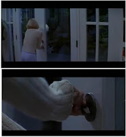
Firstly we included a match shot; for this i repeated the same action twice so i was filmed from two different angles giving a more interesting and revealing effect. Having a close up of my hand pushing the door and then a long shot from a frontal perspective is effective because the detail in a close up shows the action we should be focusing on (the door movement) and then the long shot establishes our protagonist (me). Having a long shot contrasting with the extreme close up creates a contrasting differentiating effect keeping the audience involved and hints or foreshadows we will not only see things from one perspective. I thought our match shot was effective because we created a cut that flowed directly onward and was smooth and didn't omit any information. The door fitted with the scene geography of the cuts so that it moved almost as if it was a continuous action. The weaknesses of our match action shot could possibly be that there was only one attempt of this, and the door idea of a match action shot was relatively cliche...we could have attempted a more unique match action shot with the addition of props for example putting something down or picking something up can look as if it is a continuous routine of events even with close ups of the objects as well as mid shots of the action.i also think using vehicle doors as a basis for match action shots is clever because the audience can feel like they too are in a car if you were to have a match action shot externally and then internal of the car.  Also to give our task a genre or theme we could have incorporated ideas of an action movie and the types of match shots action movies have- for example i could have jumped over an obstacle and this jump could be repeated so see it from a frontal angle and a side angle as i go over the obstacle.

we attempted to incorporate the 180 degree rule throughout by drawing our invisible line directly central of my character and didn't cross this line, or more effectively, cross the banister. because i was so close to the stair banister, we used this as a telling point for the axis of action and where not to exceed our shots. Effectively we kept to this rule throughout because we knew our audience could see it as clunky and disorientating if we didn't.

One of the main weaknesses of this task was the camera wobble we had at 0;08.This only slight camera wobble would ruin the 'magic' of the film from the audience, reinforcing that it is filmed and non realistic. it also showed lack of proper usage of the tripod which is intended to stabilize our camera. Also, there was a entire 1-2 second interval where i could not even be seen on screen, this is ineffective as there is no relevance to the bland seconds where the protagonist cannot even be seen and we should have omitted this from the cut or filmed from a different angle. effectively however, the scene geography fitted as there were two different types of shots, both of the banisters but from different angles and then this eased onto our next long shot and behind view of my character walking down the stairs. the close up shot of my hand at this point may be argued to be slightly un necessary however we wanted to incorporate the shock of the sudden stop of me walking- so the audience would be eager to know why i have stopped- leading onto a shot reverse shot where i am seen with an expression of recognition and then the shot rebounds off what i have recognized-which is Sophie- our secondary character, i am looked upon by a low angle shot so it is reinforced i am the protagonist, and when the shot reverses so we see eyeline match of what i am looking at- Sophie is filmed upon by a high level shot almost belittling her. We were careful to ensure our match action shots lined up so it was a direct eyeline match however more effectively we could have incorporated the rule of thirds in our task because often characters being predominantly central can be boring and unrealistic however having characters in the top and bottom corners or sides flaunts the background as well as the character and is more effective and commonly used.

Monday, 9 November 2015

Action movie analysis- Children of men

Children of men was released in 2006 and was intended to be a sci fi thriller however its constant action orientated plot with relatable issues lead it to be more of a dramatized action movie. the movie is set in a dystopian 2027 where society seems to have become a chaotic turmoil and women have become infertile. The film revolves around a miraculous pregnant women who is transported to a sea sanctuary by a former activist (the protagonist of this movie-played by Clive Owen).

the film begins with a crowd of people surrounded by what we can only presume is a TV which is not revealed until we receive an eyeline match shot to see what their desolate and concerning expressions are because of. Hence, if they are all watching TV, what we are seeing is not just a crowd- but an audience- already heavily relating to the audience of the film. This audience is receiving information from the TV, a format of media, just as we receive our news...yet again showing a clear relationship between the dystopian world and its citizens and us and our world now.

The costume of the characters relating to mise-en-scene is mainly business and work style clothing hinting everyone is trying to get on with their lives and they are occupied ( maybe too preoccupied to notice the graveling state of the world around them) and possibly trying to find a way of escapism ( whether this be through working and getting their mind of things, or through their earnings...to escape the dull city). The only other differentiating costume we see is that of the police officers later on filmed in a long shot.the prominence of these police officers shows that there still may be some form of control and law ( unlike in Dystopian movies like DREDD i have analysed or Daybreakers), and not everything is a dystopian mess. We straight away recognize the officers as their hard hats and navy uniforms flaunt our British police force. We do not follow, track or enable the officers to have prevalence with close ups or much camera time possibly foreshadowing how the police have little control or importance with what society has become.

 Even Though the film is set twenty years ahead- the audience can straight away associate with the scene and start of the movie because things haven't changed to dramatically- and the audience can still relate and recognize the typical cafe environment. we can most defiantly recognize this scene is set in a cafe because of the food in the background as well as the cutlery underneath the television. we can also see in this cafe that everyone is together with extremely close proxemics....showing that this is possibly a entire society issue and people are in desperate need of help. The news narrative we hear right at the beginning talking about the 'siege of Seattle' makes this even more obvious to the audience...especially because it is on a black backing leading audience attention to be drawn to nothing but the voice-over-enabling every single word to be properly registered. Right at the start, the non diegetic narrative is almost informing the audience of happenings in the country however when the screen actually changes, the sound seems to almost lower in pitch and clarity and is now diegetic as it is coming from the TV. This initial shot looks down on the crowd from a high angle, possibly empathizing the belittlement they feel in their feeble society. It also possibly shows the power of the TV as this is what is positioned at the high angle the camera films from and this contrasting use of levels for a technological object above humanity, suggesting that possibly it is technology and advancements that have the most power now, and have become out of control. The way there is no dialogue in the initial scenes makes it more clear to the audience the shock that these people feel, and makes it even more obvious the sadness and importance of this beginning scene. When finally, we see a man say 'excuse me' and almost barge through the crowd we emidiatley see him as our possible protagonist because of his prominence and prevalence in the scene and the way that he subverts from the typical 'watch and do nothing' weak society members as we see him instead buy a coffee and then walk out.Also, we see on the TV the news program about the 'youngest person in the world' dying at 18 which is an almost confusing thought and encourages the audience to be an active audience and try to decipher just from this what has gone on to the world....but this news program we see on the TV is interrupted when the key male does something as simple as receiving his coffee. The audience is led astray from the devastation of the television program to instead see a man walk out a coffee shop which must hint his importance and show how he is our protagonist.

The shots of the crowd in the coffee shop remain pretty much the same, being ordinary typical and still shots possibly linking to the feelings meant to be expressed as they have severe lack of emotion or hope..however when this key male begins to leave the shop the camera actually uses a tracking shot to follow him.

The camera tracks the man out of the coffee shop at a level that is head height to him and the camera movements are almost synchronous with the mans pace, as well as this the camera seems handheld and un still to possibly hint the unsettling nature of the forthcoming scene and make it seem as if our audience is, and should be following this man. as the camera tracks the man out and we are led onto a new scene, there are many giveaways as to where this film is set and when. The large red London buses are a big clue we are in Britain, and possibly the capital, the large electronic billboards and moving advertisements as well as the modernized helicopter in the top right hint the futuristic nature. But, are all these hints of the film being set in the future really necessary when a caption in the bottom left of the screen gives us the date of '16th November 2027'? The director seems to just be forcing its audience even more to understand the contrast in the new state of London. Although probably eccentric, i thought the toot-toots driving down the roads could in fact be a symbolic relic of hope...this mode of travel is out dated however we still see them on the roads of London today. This could symbolize how even though we have found out there is global despair and torment- maybe there is still aspects of how society used to be, with power, hope, ability and freedom to hold onto. In this initial scene, the setting is prominent because we see the litter and mere state of the streets which is far from our usual interpretations of a futuristic generation..From prior films we are fed a falsified creation of a machinery led spotless world, however this film already acts as a moral warning as we see the damage pollution and littering can do when the streets of London are portrayed in this run down state. Visible car fumes also hints this pollution, along with the diegetic noise of car engines and horns hinting road traffic and road pollution.

the most prominent part of this opening scene is when the Bomb goes off. The audience actually seem to expect this explosion more than our protagonist does as we track round 180 degrees of the man to reveal a entire shot of where the explosion is about to happen..we wouldn't have a shot of that sort  here if something wasn't about to go on. also, the shot pans out from our protagonist to a long shot of the entire street as well as our male foreshadowing how he is almost powerless or belittled in comparison to what is about to happen.

Because the camera shots and editing film the whole process of our protagonist pouring liquor into his coffee and there is no ellipsis or omitting of obvious actions, the audience almost get 'bored' of watching the man with his coffee and instead notice the background where two people embrace in the street- however this foreshadows how there is next to no positivity or happiness because just a few seconds after this, there is an explosion right next to the couple. We also see in this scene that people are thrown into the road and our protagonist spills his coffee- a prop which his dedicated concentration was stuck to. we see the prominence of the coffee as a prop because in the beginning it showed how our protagonist was different to everyone else and didn't relate as much to the news broadcast or seem concerned, but we see that when matters actually involve him there is an obvious concern and disorientation. It also shows the unexpectancy our character had of the explosion possibly showing how things are progressively getting worse...and things like this are not a normal routine. Our protagonist pouring liquor into his coffee almost is a imagery based hint of what our protagonist is like. there is little dialogue in this movie opening, so we rely on surroundings, props and setting and alcohol has strong connotations that our character could be addicted, stressed, careless or even just unstable. We known that it is alcohol he has in his coffee due to the hipster flask he retrieves from his pocket in a close up shot- reinforcing the detail and prominence we should recognize of this shot.

After the explosion, the camera diverts from the focus on our male protagonist and seems almost handheld..tilting and being un still and almost blurry as if somebody is running. The way the camera films as if somebody is running shows the urgency in the scene. As we get closer to the basis of the explosion, the diegetic sound of alarms, bells and screams all get louder- together creating an almost orchestral rendition of a disaster sound. even without any graphic imagery- anyone would realize from the sound effects that something terrible has happened.

i found it very effective that the opening scene began with an old woman timidly clutching her dog as she reacted to the TV broadcast- a passive, typical action....and the scene ended with a younger woman clutching her dissembled arm in reaction to the bomb that went off...a more atypical, disturbing action. i also in conclusion found these opening two minutes compelling as they fitted the genre of the film (action) by diving straight into dramatized action.

Shots, Editing and the rules of continuity

creating the most effective cinematic production from an array of shot types and continuous editing is a key motive for any film maker. The final cut should have precisely and neatly arranged scenes with detailed editorial skills flaunted. A preliminary cut is almost a draft of the final. When looking at shot types it is important to consider the prevalence characters receive- with the amount of screen times and close ups showing who the audience is to empathize with or view as a high status character. As well as prevalence during shots, the final shot is also key to see who is afforded the prominent final shot once again suggesting who we are to empathize with. Another key shot type is the inclusion of a cross cut...these allow the audience to move from one situation and back again. Fades, too, play a key role in editing- does the screen fade out to black or white? or even another color or scene to create a desired effect. I wanted to research the Montage editing technique further..so in forthcoming blog (world war Z montage analysis) i'm going to explore this technique further however research has enables me to understand how lots of shots in an almost collage format of things happening over time enable an audience to receive key points at a fast pace. Relational editing is another editing technique i wanted to possibly adopt ideas of in my opening two minutes as it forges a link and theme between shots- for example if we saw a helpless old woman struggling with shopping in a shot and then another scene of a boy being told he is useless there is a relatable link forged. Often relational editing is the most foreshadowing in movies. Transitions of scenes were also another key aspect i wanted to research as often transitions like 'dissolve' are used to blend two shots together so the audience are taken from one scene to another without pause..creating a faster pace. 


A match action shot (also known as a match cut or graphic cut) is a defined cut in film editing between two different object, compositions or spaces where the objects or actions in the two shots graphically match. In easier terms- an action or scene is shot from two different camera angles or shot types but still fit in together correctly establishing a strong continuity of action and link between the shot types. A match cut films the same thing but from an alternative perspective. an example of this could be filming somebody turn the knob of a door with a close up shot, and then see them going through the door from a frontal long shot. match cuts are different to parallel editing or cross cuts because they both disorientate the audience from the scene and do not focus on the same objective. Match cuts follow directly on from each other to reinforce continuity without any transitions or pause- this is a direct contrast with the discontinuity of a jump cut. shot reverse shot is a typical feature of the 'classical Hollywood' style of continuity editing which focuses on continuous action that develops linearly, chronologically and logically with no deferring from the scene. shot reverse shot also categories under the filming technique of 'eye line match'.

a shot reverse shot is simple- its just a shot first in one direction-then in the other- and back again. this is effective because it makes the audience feel part of a conversation typically..or enables a better grasp and understanding of emotions and response as often shot reverse shots are used to show a reaction or retaliation. usually, shot reverse shots work best using mid shots and close ups so that we can see expressionism and identify with emotions. The shots work well because it feels like we are seeing just what the characters are from both perspectives. also- it is almost like a rebounding or mirroring of prevalence or importance in scenes- showing who should have our focus. over the shoulder shots are used in conversational scenes just like shot reverse shot to see things from opposite perspectives. shots like this are more effective than simplistic, still, two shots or long shots because we have a limited view of emotion and restricted involvement in the scene. often these shot reverse shots can be a direct eyeline match so we see exactly what a character is looking at as the camera follows their point of view-creating an eager audience to see what the character does. Eyeline matches in film are completely different to graphic matches because graphic matches occur when two shots that match graphically are purposely matched and placed after each other or after a overlap transition...an example of this could be a shot of an eyeball and then a shot of the sun, or the famous shot in 'A Space Odessy' of the monkey throwing a bone which then matches the space shuttle- this is because both are the same size and shape on the screen- showing a relationship. The last editing terminology involving a 'match' in scenes is an action match. An action match often portrays two different views and different shots of the same action which are then edited together so the action appears interrupted.  Back to eyeline match shots....To ensure this works, in shot reverse shots we have to imagine a line between two characters or a character and an object...this is called the axis of action- leading onto my next point-the 180 degree rule! This axis of action is important because filming needs to be maintained from only one side of the imaginary line....if the rule if broken and you've crossed the line, viewers may feel deluded and disorientated with shots that do not fit together in a smooth cut. This rule is called the 180 degree rule because the camera cannot move further than 180 degrees (half a circle) around the subjects. often- when using this rule, it is typical for the first character to always be frame right of the second character who is then hence frame left of the first. 


Tuesday, 3 November 2015

Sound and Foley artists

                        What is Foley?

Foley is a special technique for manipulating sound and adding louder, more prominent sounds with more clarity to a film or televised production, It was named after Jack Foley who created the whole idea of the process. Foley effects are added during post production so that they finalize and empathize actual sounds from the production and make them seem diegetic and loud. Common Foley sounds include sounds of door knobs, keys, doors opening, footsteps, food/cutlery, violence (punching/hitting) and glass breaking.

A 'boom operator' has a predominant and singular job to only record dialogue in the media production, however every other sound is included by the Foley artists. It would be un-effective to simply film and try to empathize these sounds during the acting because it would take the focus off the acting and make the sounds seem forced and un-realistic. The Foley artist maintains complete control over the intensity of sound, fading of sound, volume of sound and type of sound..for example a door that may not actually creak could have an intensified Foley sound if for example it is to be used in a horror movie. 

Foley artists are the responsible personas for the sound effects. typically, they have a Foley stage or room with variations of common surfaces, props, terrains and everyday objects that can create the most normal or abnormal of sounds. The Foley artists cleverly synchronize a sound they can make with an action in the film (for example a sound of hailstones could be empathized by tipping lentils, or a sound of wind empathized by a whirly tube or a broken window empathized by breaking a glass, the sound of a punch could come from hitting a side of beef, or the sound of a broken bone could be made by a carrot of celery). Alot of Foley sounds are modernly created instead with a electronic device or keyboard because this can be much cheaper however for my movie opening i think creating a temporary Foley stage would flaunt creativity and synchronization with my film and i would be involved in every aspect of the film to make it seem like a real movie making production.

Foley is used in all film genres however for each genre it holds different purposes...for example in comedies sounds are enhanced for comedic effect to make accidents or situations seem more empathized and amusing, in action films Foley over runs all dialogue to make chases, cars, fights etc more dramatic and in horrors slight uneasy sounds are made louder and more daunting. 
Foley can also be used to enhance comedy or action scenes. Watch most comedy films and you'll notice that many of the sounds are enhanced for comic effect, and sometimes the Foley sound is the joke. As for action, most fist fights do not involve the actors really hitting each other, and even if they did we would not be able to record a satisfying punch sound. By punching and variously molesting such objects as cabbages, celery and sides of beef, Foley artists can record unique and much more 'realistic' action sounds.

Sunday, 1 November 2015

First attempt at using a tripod

Here is a simple cycle of the shot types we used to create a short introduction to our first time using a tripod. We used the phrase 'what are you doing here?' as a basis for the shots but changed the location and shot type each time. In the clip above, we used movie maker, however from the clip below you can see that we attempted to bring in sound effects and more complex tasks when we used adobe.
When we used adobe, as well as fitting in many different shot types we also attempted to play around with the sound. for example we added in the sound effect of footsteps as Sophie walked down the hall, the sound effect of girls in the bathroom that dramatically was cut as i spoke, the sound effect of birds to empathize the diegetic sound that would be in an outside environment and we even altered the volume to reinforce the sound of 'what are you doing here'. to improve, we could have altered the pace of scenes, added in more dramatic features and transitions as well as sounds.

romance movie analysis- When Harry met Sally & P.S. i love you

I chose to analyse two completely different romance movie openings for this task to see whether the time setting, plot and basis differed, affecting the movie as a whole. 

The first opening scene i analysed was from a film titled 'when harry met sally'. The opening scene begins with an almost interview style two shot. This effectively makes the film seem realistic already; a typical convention of romances because two shots like this are often used with non-fiction documentaries or interviews. Many romance films attempt to make their plots and themes realistic and extremely relatable so that 'hopeless romantics'- a wide proportion of romance fans- can enjoy the relation to everyday life. The two shot, in comparison to any close ups or singular shots reinforces the idea of couples, shared love and togetherness. Also, the actual age of the two characters suggests they are experienced, mature and in a long lasting relationship. Their age and dire appearance may not automatically appeal to a young looking-for-love audience or middle aged females, also a wide target audience for the film however their dialogue is a automatic appeal. The older male begins to describe when he first met his lover, and talks of her being 'beautiful' as she looks at him in admiration. this makes the audience feel more convinced that this is a true and 'beautiful' love story. By 20 seconds, the subject of marriage has already been breached- the male talks about marrying her after two weeks and being together ever since. Marriage is a typical convention and ending or struggle in romances, it can often be the climax or the ending of a romantic movie.

Next, we receive an establishing shot of a college or university style old-fashioned campus. This completely contrasts with the older couple because this would be the typical setting for young, first love. The non-diegetic soundtrack that plays along to this is a love song, for audiences of the time this would be very current, relatable and new to audiences who will listen to the words and the songs meaning, however to more modern audiences this song sounds like a fairly old and distinguishable record that would merely be connoted with old times and the movement of jazz bands of old times with their romantic songs. A song like this to modern audience, could trigger a heart-throb already because this song could easily relate to the constant and wholesome love of grandparents and older couples.

at around 0.40s we get yet another two shot, much like the one we see in the begging...however this two shot is much more close up and at eye level.  the closeness of the shot could possibly link to the intimacy of the young lovers and how first love is always felt most deeply and intimately. this is reinforced by the couple we see now being completely embraced whilst looking into each others eyes. conventionally, typical romance films follow couples or individuals throughout a number of years- so having an old and young couple appeals to a much wider audience. The camera begins to track round the couple almost 360 degree possibly connoting the round and round cyclic routine of love and how just like the circle the camera travels around in, it is never ending- supposedly like their love. This round style of tracking could actually almost foreshadow the link symbolically to a ring- given at marriage- a symbol of eternity.

after the first Minute of the clip, the non diegetic soundtrack begins to be interrupted by the diegetic sound of a car engine. This car engine noise is empathized, probably through the techniques of a Foley artist to make it more interuptive and loud. Just after this we receive a close up shot of a secondary woman, her facial expression being comedic like an 'awkward onlooker' to the kissing couple. this regains a sense of the rom-com sub genre into the movie as we already get a hint that this movie may not just be simple, typical romance but also revolving conventionally around friends-especially best friends- and other important key themes also. Apart from the blonde hair connoting this female could be 'ditsy' and feminine, her shy expressions caught in the close up and quiet cough to get attention suggests the polite, helpless nature of this female. The audience immediately are left confused when the first main dialect in the scene introduces this girl onlooking a couple kissing as Sally, whilst the male kissing the other girl is Harry! this creates a automatic intrigued nature from the audience who at this point will not understand the connection between these two characters. The long shots showing the close proxemics and intimate body language of the kissing couple show togetherness however the tightly framed simple close ups of 'sally' alone in the car shows how she has nobody close within her proxemics or anyone she can call 'hers'. The interuptive car horn as a synchronous diegetic sound almost fits the woman's mood entirely as she is beginning to get stressed and angered at the couple and as well as the camera shots showing this with her expressions, the sounds also show this with the bold, loud, angry sound of the car horn. The music as the car starts off is the same as the music that introduced the movie and the initial establishing shot...this could foreshadow that the new match in the car could possibly have a romantic future, also hinted by the title 'when harry met sally'.

As the duo invoke in conversation during the car journey, the camera shots alter as each person talks, almost as if it is an informal interview. They both remain in the shots the entire time, hinting their togetherness possibly as the film goes on. An effective establishing shot is portrayed as the journey rears out the city and tracks the car whilst angling upwards to reveal the towering cityscape of Chicago. this hints escapism as we see the car first leaving the college, then leaving the entire city however this could lead onto further escapism- possibly characters escaping their insecurities, brave fronts or metaphorical disguises. we know for sure that the duo are leaving, because the same cityscape of Chicago we see in the establishing shot appears once again, in the background of the shot at 3.28 in the back mirror of the car. The camera at points during the car journey seems to be uneasy and seem hand held- possibly to reinforce the idea of being in a car so the movie doesn't seem staged or false. this once again allows the target intended audience to pick up yet another relatable routinely activity.

I found it very effective that the woman was holding the steering wheel in this opening scene. this is because, in action movies Joseh Queenans movie cliches article told me 'women never drive' which i found to be typically true as generally the woman is the prize, or the subject that evokes the protagonists care and attention and with action films being a huge male orientated target..you rarely see women in control. however, effectively here we see the female is in fact in control of the situation and she is the one driving. This can almost already give out a moral message to the typical female audience of how females are equally important and reliable. this film was released in 1989, not long after feminism movements and the rights females obtained had increased.

At 4.14, a differential establishing shot hints the movement to a new time or scene as we see a more rural land mass surrounding the car, and a much darker, later time of day. We hear the digetic sound of arguing over the non diegetic soundtrack of old-fashioned high pitched cords arranged in a melody which makes their argument almost seem petty and irrelevant. This juxtaposition of sounds possibly could show that not all arguments and disagreements are negative. once again, a coupled or searching-for-a-relationship female would be able to heavily relate to minor arguments like these. The darkness could almost act as pathetic fallacy in the scene because as the mood and conversation topic gets darker; the outside weather replicates this.

The second romantic trailer i analysed to compare with 'when Harry met Sally' was called 'P.S. i love you'. The title alone, mentioning the most important and key connoted word with romance films 'love' possibly gives away that we are not going to follow the path to falling in love of two characters ( like in the first film), but more be introduced to a couple already in love and the 'p.s.' is just a reminder that this love is going to stay. The 'p.s' also hints to us that this film could possibly have a prominent focus on letters or messages as the abbreviation is a frequent end to letters.

the first scene of the movie is very different to the first scene of when harry met sally because most prominently, we don't see 'love' immediately. however the psychological question could be asked what actually is love? is love really just a smootch to begin a film...or is love an argument between a couple that rigorously has attempts to  be resolved, with a comedic (not rude unlike the other film) male that is just dealing with a minor relationship flaw? Because we see a couple arguing straight away the audience can automatically relate and see realism and truth in this film because typically relationships always have arguments,its just a part of being together. if the film was very romantic and converting to the romance genre entirely it would seem like a false and cliche representation of love. During the opening minute of the film, a love song by the Pogues called love you till the end plays, which shares similarities with when harry met sally because both movies use love songs that are asynchronous and non diegetic. Both songs however hint to the audience where there is love and who shares it.

In both movie openings, the characters seemed a similar age, not to young or too old to restrict the wide audience romances attract from watching the movie. Also, the males in both films are the ones causing friction in the relationships- never the loving females. Right at the start of this film however, a long shot down a corridor frames the woman as she walks pace-fully and almost angrily back to the apartment with the male trailing at her heels. We don't receive a two shot here, instead just the man in the background unlike the foreground position of the woman that is tracked with the camera almost throughout.  The man being behind hints to us that this female is possibly our protagonist or the main relatable subject of the films for the directed female audience. most romances typically follow a hopelessly romantic or looking-for-love female which is displayed in these initial scenes. i could have effectively compared this with the introduction for 'Notting Hill', a romance which completely subverts these typical romantic movie cliches because we almost entirely follow the male in the film. Mise-en-scene comes into play in both movie openings i analysed in one way because of the costume worn by the characters. In 'when Harry met Sally' the characters wear quite casual yet fashionable youthful and relaxed clothing hinting we will be casually and slowly eased into this laid back love story..however in p.s. i love you both characters wear formal party wear- hinting their maturity and sensibility in a more adult and developed serious relationship and as well as this the clothing of such a formal adult manner shows their age- possibly deferring PS i love you from being a teenage young girl rom-com.  as previously mentioned that in PS i love you the man is often in the background, we also receive a camera shot at 0.15 of him which is a high angle shot looking down and possibly belittling him, involving the context, we know that he should rightfully be looked down upon as he made a prior mistake at the party they were at. the way he looks up from his low angle at the female, Holly, makes her seem almost superior and looked up-to like every girl wants...a man at her feet! after this shot, the camera tracks and follows the man up the stairs with a hand held shot so the camera too is almost moving with the man and the audience possibly feel his passion for running up the stairs after his partner.

in 'When Harry met Sally' we  see scenes based in the surroundings of a college, city, car and outside field all in the first five minutes of the film- flaunting the adventure and freedom and opportunity of being young. we also receive natural lighting throughout which lets us as the audience realized how raw and relaxed the love in the film is, however in PS i love you we only receive scenes shot in and just outside the apartment. This could connote less freedom when in such a mature relationship, but also could merely show the simplicity of love. there is no natural lighting in the opening five minutes of the second film which could suggest a falseness in the love or simply just reinforce how the opening is taking place at night....and for couples nights are usually time for love, embrace, making love and togetherness. In both films there were small clips reinforcing it was night time which i think effectively showed these qualities. Also, the establishing shots of the couple in the second movie connecting them with their surroundings created a link with the messy disorganized apartment and the disorganized not-so-simple aspects of their relationships.

The proxemics in the first film were continually closer with the couple at the begging and when harry and sally were in the car, however it almost seemed forced that Harry and Sally were so close as they were in a car and couldn't be any further away from each-other, however in the second film PS i love you- the proxemics of the couple were always enlarged almost as if they got further and further away from each other as the male aggravated the woman more and more and even at one point we received a two shot separated by a wall, until finally, the opening scene ended with their proxemics irrevocably close as they kissed and embraced and forgave each other. when we saw shots of both couples together throughout both opening scenes i noticed how in the first film the camera shots were still and at eye level, mid shots that filmed the couple in the car however in the second film the shots were often long shots showing the body language of the couple as they argued.


action movie analysis- James Bond Quantum of Solace and skyfall

At the very beginning of the film just after the title credits there is a fade to black where the audience see nothing yet can hear the fast paced chords as the soundtrack of the film as a non diegetic sound. This creates a brief anticipation, which is briskly revealed in an establishing shot of a mountainous, beach landscape. This sort of landscape is atypical of usual Bond movies, so the establishing shot straight away introduces the audience to somewhere original and new. The soundtrack does not seem to be fitting to this landscape as typically you would expect the diegetic sound of birds, crashing waves, the sea breeze...however asynchronously the music continues- increasing in pace and volume as the camera pans nearer to the mass of rock. Action movies like the Famous bond films usually begin with fast paced full pelt action from the very first few minutes, there is barley any introduction and the conventions of constant cyclic action are met very quickly. In this quick paced action style, the camera shot cuts to a completely juxtaposing extreme close up of the wheel of a car zooming around. The low chord non diegetic fast paced soundtrack continues, however the synchronous diegetic sound of a car engine begins to come into play alongside the shot. The extreme close up pacefully alters to a high angle shot looking down upon the car and then once again an extreme close up wheras this time it is the back of the car. Not much is revealed in these very brief shots of the car, however the audience would assume it could be Bond or even a key antagonist driving because this car is obviously of importance, and its shiny coating and dark black coloring suggests a mystery or an enigma. These car shots contrast with the surroundings because we wouldn't connote such a peaceful looking almost euphoric setting with a fast travelling mysterious car, however the alternation of the shots of the huge rock mass and the car both hold a link because both are large, powerful and both seem to maintain this link additionally through the same soundtrack played with each.

The camera pans closer and closer across the water to the large rock mass where it becomes evident there is actually a road. zooming across water like this is a technique used in movies like titanic, and many romance movies as water and the sea usually connote distance and travel- which can show how love too can travel across distances. Also, still water like this connotes peacefulness, or would be the setting for a boat journey..a chance to have establishing shots of picturesque surroundings however the car chase and fast paced camera tracking takes away all attention from the surroundings. More extreme close ups of silver wheels with delicate noises among the soundtrack keep the audience even more in suspense until finally the first glimpse of any character is revealed with the eyes of a concentrated male. Non natural flashes of lighting illuminate the eyes of this man suggesting he could have a dark persona, or be an antagonist because we are left in mystery about the rest of his features...however in an alternative perspective...this could merely show the secrecy of Bond and create an awaiting lust for his presence.

At 1;02 the soundtrack reaches a climax and reaches its highest pitched notes when it is immediately cut off by the loud roaring sound of the car engine as the car for the first time is seen in daylight. we see a long shot of a silvery car..which leads us as the audience to presume that there is a car chase due to the shiny black car we were introduced to previously. Every camera shot is very fast and cleanly cut to a cycle of alternating shots for example a wing mirror close up shot recognizes the look of the other car just after the long shot. The camera tracks one of the cars, however infrequent medium shots capture a possible antagonist shooting a machine gun at the other car, smashing the back window. Although the shots are so quick and difficult to understand the full scenario- we know there is a dangerous car chase...once again typical of action films and in particular Bond films as Bond always has a flawless modern vehicle. at 1;10 a low angle shot seems almost hand held at ground level looking up at the cars and here as the audience are meant to feel the uneasiness of the scene, which is reinforced next at 1;12 when we see Bond with his hands un-easily on the wheel of the car seeming almost calm yet concentrated and in danger. the camera tilts towards a canted angle at points like this where we see Bond managing to take control of the situation and maneuver the other car out of the way. We recognize that the male we see is most definatley Bond as the un-mistakable side profile of Daniel Craig is a hint, as well as the pristine recognizable James Bond suit. Point of view shots also allow us to relate to Bonds character and we see the danger from his perspective, rather than point of view shots from the perspective of antagonists which would make our hero seem belittled. such a wide variety of shot types allow the audience to be enticed to almost a 360 degree angled shot of the entire action packed scene, making the whole environment seem daunting, putting viewers on edge and with the different sounds and shots making it almost seem like a simulator kind of animation...like we are actually there too. At 1;21 a handheld non-still shot above a punctured wheel is effective in showing even minor details and showing a contrast in the still and wide shots showing bond and the hand held close up shots showing Bonds achievements or skills.....however this completely subverts Bonds powerful steady representations when at 1;24 the camera shot focuses blurrily and un steadily on Bond when he is almost scathed by a large metal prong that plunges through his car door.

The car chase continues at this fast paced speed with alternate angles and close proxemics of the cars up until 3;31 where bond actually manages to defeat one of the antagonists and the music and action dies along with the driver. after this, we realize that Bond is still alive and well and his car drives through a more safe looking haven with stone archways and a town style. the non diegetic soundtrack looses volume, low notation and pace and we reach the outcome of the car chase..however we know that because this is only the opening few minutes there will be a lot more action to come. The scene is found to be Italy, and we receive a long shot of Bonds car from a tunnel view making it seem even more superior and awaited. when we hear bond state 'its time to get out' to his captive antagonist in the bonnet of his car the filming cuts straight to the famous bond opening credits which leave audience in suspense after they have just met and heard the new famous bond actor, Daniel Craig. also, his dialogue is very vague making interpretations of what he has just said very broad. I thought it was very effective also that this action movie began with a fast paced driven car and ended with a safely stopped one...this flaunts the car chase cliche all action movies adopt and also shows just how much importance vehicles and travel mechanisms have in action movies.
I wanted to compare Quantum of solace with another of the Bond films to confirm any comparisons or additional genre conventions of action movies. The opening scene to this bond movie, Skyfall, begins with a motorbike chase-linking strongly to Quantum of solace because both involve fast paced high power vehicles. Also the fact it is between Bond and an antagonist once again shows that often the heroes, incredible spies or key protagonists of action movies are commonly always followed by an enemy of some form of opposition. Bond in this film uniquely subverts from the typical black dinner style suit he is always pictured in and instead flaunts a tanned sandy colored suit..however we still recognize him due to the famous actor playing bond from other movies- Daniel Craig and the smart suit and gun. We see Bond in the fitting role of a spy with his sophisticated, smart and clever mannerisms. The suit color almost fits the setting of this Bond movie as it is set in Istanbul in turkey and the sandy off yellow surroundings almost make his suit seem like a camouflage- reinforcing that he is possibly on a secret mission. The black conventional suit Bond wears would seem inappropriate to the surroundings as Bond would stand out too dramatically and his spy cover immediately revealed. The location here is effective because the conflict that actually has happened throughout history in Turkey would make an audience be able to relate to international issues in Turkey and see almost a context behind the film and its location. Also, having the middle eastern antagonist in his home surroundings automatically creates a brand new exclusive location for the film regarding issues further from Bonds HQ.  

 The main conventions of the opening scene is much like Quantum...to create a chase is that is exhilarating, enticing and a scene to reinforce the genre...hence why a vehicle chase is just fitting.  In contrast, the opening scene differs to quantum because in the prior film there is few people, we are introduced to nothing but cars in the first few minutes and the exotic coastal Italian location seems peaceful however here the village the chase is set in is greatly populated, hinting to the audience there will be confusion and difficulty in the capture of the antagonist. Most Bond films however do in fact begin with a capture of an antagonist...flaunting Bonds power very early on.