These works of art acted as a concept of inspiration for our film making process because art is a visual form of expressionism and uses no typography or oral mechanisms and therefore the observers of the piece are left to their own interpretations and understanding of the artwork. This is particularly relevant to our film making process because we are choosing to have a a silent opening to our film, trying to create almost a phantoscope feel to our project. We also want to make our movie look very raw, and realistic yet not quite natural which is why these paintings by Nicola Samori had a significant appeal due to the realistic imagery yet dead chilling color choice and rawness. Nicola Samori scratches off the surface of dark intense paintings to unveil previous purposeful layers of work, making the peice display a sense of destruction and ruin- however also beauty in the artistic tenchnique. this ties in with our movie opening where the youth of the young girl is meant to connote positivity and happiness yet is twisted like these paintings and given a more warped connotation of horror and danger. We wanted to give our movie a macabre feel, alike to these expressive paintings. Also, Samori is said to create art forms like the ones above to reveal 'a true and hidden identity' much like the identities that remain enigmas in the begging of our film.
Friday, 18 December 2015
Concept art (gothic)
These works of art acted as a concept of inspiration for our film making process because art is a visual form of expressionism and uses no typography or oral mechanisms and therefore the observers of the piece are left to their own interpretations and understanding of the artwork. This is particularly relevant to our film making process because we are choosing to have a a silent opening to our film, trying to create almost a phantoscope feel to our project. We also want to make our movie look very raw, and realistic yet not quite natural which is why these paintings by Nicola Samori had a significant appeal due to the realistic imagery yet dead chilling color choice and rawness. Nicola Samori scratches off the surface of dark intense paintings to unveil previous purposeful layers of work, making the peice display a sense of destruction and ruin- however also beauty in the artistic tenchnique. this ties in with our movie opening where the youth of the young girl is meant to connote positivity and happiness yet is twisted like these paintings and given a more warped connotation of horror and danger. We wanted to give our movie a macabre feel, alike to these expressive paintings. Also, Samori is said to create art forms like the ones above to reveal 'a true and hidden identity' much like the identities that remain enigmas in the begging of our film.
Wednesday, 16 December 2015
Filming software- Adobe premier elements
Premier Elements enables us to have a scene-line which we can use to place clips in certain orders...and as well as this we can easily cut clips from the scene-line or even just cut out irrelevant points such as the very first few seconds of a clip. The software provides transitions and effects like fade to black, dissolve,3D and curtains however with a professional approach, we are only going to be using the fades- especially for our film credits.
Premier elements is the closest we are able to be provided with to a professional movie industry editing programme. For this reason, this particular software will enable us to create the most successful opening. We have considered that alongside Premier Elements we could experiment with manipulating imagery in Photoshop and even making final adjustments to our movie in its final upload to you-tube with the you tube editing tools to change contrast and any subtle filters.
our previous experimentation and experience with Premier Elements came into play with our 'what are you doing here' preliminary task where we experimented with the sound levels, addition of sound effects, cut clip beginnings and endings that were invalid, changed order and timing of shots. We additionally experimented with Premier Elements when we created our preliminary task with match on action and shot reverse shots and had to accurately edit the timing of shots here to make our clips seem realistic and structured.
Camera research- Nikon & Go-pro hero 4
The Go-Pro HERO 4 is going to be used by us to capture the more active scenes of the movie opening, as well as being used to capture action from different angles. We will also be taking full advantage of this particular camera because it is best when used for sporting/ high paced action and scenes so we are going to use a hired chest strap and head strap to strap onto our male actor when he is running from the crime scene to receive point of view shots and canted angle and handheld appearing shots creating an uneasy feeling.
Alongside these cameras we are using a school provided tripod which will keep the Nikon camera sturdy and supported. We will only be using this tripod when using the Nikon camera because the HERO 4 is going to be used to film more uneasy shots taking on traits from self filmed movies like the Blair witch project.
Camera trials & location analysis

 Because we are filming our movie opening outdoors, natural lighting is the predominant source of light that we will be using. Because of this, it was important we analysed the lighting of our location, considering what time it starts to get dark and when there the is specific period of dusk that we aim to film in. As well as this we wanted to analyse the artificial lighting with the lamp posts that scatter the paths and decipher exact location points to use. If we choose to include darker scenes or a progress of time with editing through ellipsis we will need to considering the artificial lighting of lampposts or even our own lighting. We liked filming with the faint glow of the lampposts however the yellowing lighting was almost to warm to work with and gave off a safe and warm feeling which is not the feeling we aim to get across in our horror movie opening. The lampposts also reinforced the idea that this was an inhabited, almost metropolitan area whereas we choose this particular area of forestry in attempt to get across feelings of a desolate, lonely uninhabited area. Additionally, The lampposts frequently had signs or notations attached to them which made the whole atmosphere seem civilized, safe, normal and formal however as a horror movie we wanted to empathize feelings of fear.
 The evident images i have included picture me doing some of our first camera trials, as a preliminary filming task. Because we are using multiple cameras, we wanted to experiment with the tripod and appropriate angles and views to use. We took the tripod and Go-Pro kit to our location and did trials of some of the shots we wanted to capture as well as panoramic views of our location. We also captured images of the location at different points during the evening to see when the best light was for filming because we have decided on filming over different days to get the optimum light intensity and appropriateness for our filming rather than having the problem of filming as night draws in with the fast pace at which it gets dark. For this reason we decided the best plan for our filming progress was to film from 2;30-4 on one day and then repeat these exact same hours the following day. If we completed evening filming over one evening it would be likely the light in our shots wouldn't co-ordinate or match making our film less effective.
We wanted to annihilate any possible difficulties we would have with filming before we actually went into the official filming process so already we took into account issues like camera memory, sound clarity and Go-Pro set up that could occur.
We also did a comparison trial with a Nikon L840 and a Olympus VG-180 to analyse which camera had the most clarity, memory, best playback and was most appropriate for our movie- which was the Nikon.
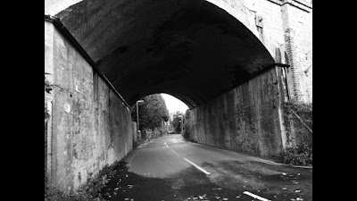
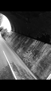 On our location and camera trials we also investigated the public interaction we would have in our location and tried to gain an understanding on the amount of passers by or interruptions to filming we would have. The later it got, the less passers by there were- however this proved a problem because we cannot film in the way we aim to with no lighting. On average, every ten-fifteen minute interval there was a by passer which we will take into account for future filming.
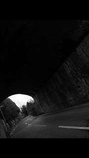
In these photographs we have captured the Tunnel that we wish to film using, because it is one of the most prominent scenes in our film. We have edited the imagery to make it have more contrast and used a black and white filter to define the dark emotions we will be representing in our film opening. These images also view the tunnel from different angles and ends so are going to effectively help us to achieve the perfect camera angles to film the final scene from. The photographs also include the two key aspects of the movie- the road (where the main action happens and the girl is hit by a car) and the tunnel (where the film opening concludes).
Tuesday, 15 December 2015
future target consideration
in order to complete and evidence all of our research and planning me and Sophie need to collect more evidence of the planning we have put into the mise en scene technical elements for our movie..for example documentation of the sound processes and ways of eliminating distracting noise need to be documented as well as how we are going to use lighting and the exact action that is going to take place so we not only have a storyboard, but a script, summary and camera angle list to work from.
what i personally need to do to improve our coursework is keep on track with my blogging as well as illustrating more of the production process with accurate sketches and preliminary drawings. i need to be able to be certain on the camera angles we are using to capture specific action in the scenes, and i need to create a original and distinctive soundtrack possibly using my own instrumental abilities.
what i personally need to do to improve our coursework is keep on track with my blogging as well as illustrating more of the production process with accurate sketches and preliminary drawings. i need to be able to be certain on the camera angles we are using to capture specific action in the scenes, and i need to create a original and distinctive soundtrack possibly using my own instrumental abilities.
Saturday, 12 December 2015
history of the horror genre
Horror films are one of the oldest movie crazes and genres going back over a 100 years ago. warped thoughts and vivid imaginations have always tended to trigger the minds warped thoughts to see ghosts in shadowy shapes and fear of the dark and its connotations....creating an emotional connection to the unknown and the improbable..Watching a horror film is particularly effective as it gives an opening into that scary world, into an outlet for the sense of fear and horror.. without actually being in danger. There is a heightened thrill factor associated with watching horror movies, and they allow through imagery horror ideas to come alive like a book or novel would never depict. The first horror movie, only about two minutes long, was made by imaginative French filmmaker Georges Melies, titled Le Manoir Du Diable (1896, Fr.) (aka The Devil's Castle/The Haunted Castle) -

Oscar Wilde's 1890 Faustian tale (*Faust is the protagonist of a classic German legend. He is a scholar who is highly successful yet dissatisfied with his life, which leads him to make a pact with the Devil, exchanging his soul for unlimited knowledge and worldly pleasures*) The Picture of Dorian Gray and H.G. Wells' 1896 story of The Island of Dr. Moreau were adapted into early film versions. In many ways, the expressionistic German silent cinema led the world in films of horror and the supernatural, and established its cinematic vocabulary and style.
Many religions, myths, folk-tales and cults expressed the idea of blood connoting life. Vampires began to emerge in popular fiction of the 18th and 19th centuries, during which time Dracula was written.
Friday, 11 December 2015
codes and conventions
Codes in a film are a significant factor that create a strong representation and meaning to the audience. there are different sub categories of these codes which encourage the audience to realize connotations and denotations which conform and subvert to stereotypes.
Audio Codes -sounds which the audience hear in the film:
dialogue
music
special/sound effects.
dialogue
music
special/sound effects.
Written Codes - any written words/phrases/passages which are present in the film:
headings
subheadings
logos
labels
font
size
placement of the writing and signs.
headings
subheadings
logos
labels
font
size
placement of the writing and signs.
Technical Codes - this regards the usage and techniques of equipment that is used to tell the story, this heavily links to the technical elements of the film:
camera angles
camera movement
lighting
camera shots
framing onscreen
perspective
layout
Symbolic Codes - anything which has a symbolic meaning and shows what is 'beneath the surface' of what is obious and pictured on the screen:
juxtaposition of characters/objects,
lighting,
use of color,
feelings/emotion,
equality and stereotypes.
juxtaposition of characters/objects,
lighting,
use of color,
feelings/emotion,
equality and stereotypes.
Conventions of a film are the general typical and expected methods and ways of producing a film (differentiating with each genre of film).
Thursday, 10 December 2015
Wednesday, 9 December 2015
Costume research and planning
For our protagonist, we wanted to use a young girl who will be played by my sister. Youth is associated and connoted with innocence and hence this would be an appropriately aged and dressed character to give a disguise or mask of innocence, especially if our main character is actually the antagonist-seeking vengeance and not so innocent after all. This usage of a young appealingly innocent girl will create an even more warped and chilling theme to our film because young children are often used in films like the woman in black, orphan and even children of the corn which are all similarly themed films to our own which we have taken inspiration from. We thought a long nightie or dress would reinforce the setting of night-time..suggesting the alter perspective of this whole situation being a nightmare. Also, the idea of a long nightie is almost ghostly and creates a feeling of absence and delicacy. The white color of the nightie would suggest purity and innocence- as well as being an easy color to stain with blood which would contrast and be highlighted with both the colors. White in the bible has connotations with doves and peace- doves suggesting freedom and presence and peace being completely juxtaposed with our protagonists spirit being uneasily not at rest. The long pure and delicate nightie would be pristine alongside the perfectly tidy hairstyle and mannerisms of the young girl- this would then create a huge and noticeable contrast when the girl is covered in blood and in complete uneasiness and disorientation. A teddy as a prop would be useful to show the fine line between the realism and fantasy in our film- the realism being the local and familiar setting and the fantasy being the idea of 'defeating death' and paranormal haunting, The Mise en scene prop of the ribbon in the characters hair is symbolic of childishness and youth with typically young school girls having ribbon tied hair. Ribbons also connote precious possessions and almost the anticipation in opening something (like a gift) and the idea of the unknown- which in this case the idea of the unknown is haunting and chilling.
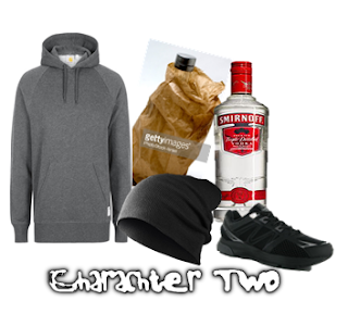 For character two, we didn't focus so predominantly on the male because we wanted our male antagonist to be mainly filmed in the darkness and shadows, unlike the young girl because we wanted her to be in the headlights and featured under natural lamp post lighting, and artificial professional lighting to illuminate her facial features and injuries in some of the scenes. The dark hoodie we propose the male wears is a typical form of mise on scene where hoodies are associated with crime and hiding away- which our character is doing as he hides from his crime of drunk driving. The beanie that we wanted our second character to wear possibly hints him hiding his identity, which could be one of the enigmas of our opening scene because his true identity is often kept in the dark- until the end. The inclusion of alcohol bottles is an important plot because there is very limited dialogue in our movie opening, so we have relied on plots, camera shots and body language to get our story line across. The alcohol bottles will be filled with a proxy substance, like water or a tinted liquid- however this will confirm to the audience the drinking habits of our driver and the causation of the car collision. Having the car in a poor condition and messy state is effective because it will hint the social status and general personality of our main male character- especially with brown paper bags and cheap alcohol hinting he may be very poor or even homeless. This would entitle why he is in the drunken state he is, and make him appear even more careless and deserving of the fate at the end of the film from the girl who comes back to life.
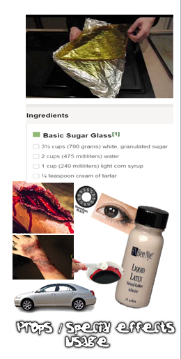
We wanted to make our movie safely in a safe and secure environment- however key inclusions in a car collision scene like glass would be too dangerous to use- however as an alternative we have experimented with creating sugar glass- a cheaper and safer alternative made with syrup and sugar. Although this method of creating a glass substitute takes time and can have a yellowy tint- it is effective in the low light of the evening we are going to be filming in, as it appears to simply glint and reflect light in low natural lighting. We also wanted to create special effects and makeup for the movie- especially with the car collision victim because her injuries have caused her death- so need to be prominent and visible to the audience. For this, we are going to use liquid latex and create blood using food dye and cornflour. Additionally, with the use of dark makeup and talcon powder in a paste- we will be able to create deep and severe looking injuries. The car that is going to be used in our piece, driven by a fully licensed middle aged male, is going to be silver, possibly with a ladder on top or roof rack showing the man possibly lives out of his car, and in a relatively poor condition. We considered using contact lenses for our young girl in the movie because especially for the extreme,e close up when she opens her eyes- these lenses will create a more dramatic suspense and prominent event of the opening of our movie, however we have highlighted some of the dangers of contact lenses with eye irritation and color of the natural eye causing an additional problem to how the contact lens color is shown so we are still uncertain about this inclusion.
Our Anamatic
The sound effect of the car collision we used: https://www.youtube.com/watch?v=_TXTfLKIFrk
The creepy sythetic sound effect we used: https://www.youtube.com/watch?v=wrBEF3QLwCo
These two tracks we used to accompany our anamatic were both non copyright sound clips that we could propose to use in the production of our actual movie, however creating a piano rendition of our own created piece would make the movie itself feel more like our own and more original and ensure we have been involved in every part of the film creation- from shot types and camera angling, to mise en scene, lighting, sound and editing. We listened to many different horror movie soundtracks as well as different compositions created in a computerized manner on sites such as you tube and we recognized similarly in all of the soundtracks- the instruments most prominently used were woodwind and piano or organ style instruments with a lengthy 'grace notes' and completely contrasting high and low pitched notes. Also- there was almost the synthetic xylophone noise played in many horror soundtracks- as well as warped and distorted natural noises- like the wind or doors creaking for example which were used alongside actual instrumentals. Noises like this could be made independelty by Foley processes by both me and Sophie- especially with props like wine glasses, running water, creaking doors and wind/ whistling.
Wednesday, 2 December 2015
Institution research
We chose to analyse the Twisted pictures institution for our horror movie research because Twisted pictures are the prevalent company behind the production of some of the most famous and famously chilling horrors. This was exactly the type of ethos we wanted to obtain behind our film production because we want it to seem as if a credible,appreciated and experienced company have produced our film. Also, Twisted pictures is focused primarily on horror and horror/thrillers so it has a direct market much like the institution logo and idea that we want to create so we can feel like we are familiarized even more with the target audience.
Twisted pictures is an independent american production company that was founded in 2004, and after its successful introduction to the film market, the company famously created the SAW film series. This box office success then led to a 'distribution deal' with Lionsgate...creating an even more credible status for the film institution. Although Twisted pictures created 6 sequels to SAW and have gained notable recognition, in a contrasting perspective, this could limit the audience that actually have seen this logo and film institution before if it is only based on one film series. This may make it a less likely institution to research for our own film..however as SAW is probably one of the most successful forms of horror, it creates a huge link to the anticipated success of our own film. Also, i personally was drawn into this film institution because of the SAW movies, which have hence reached a wide audience. The SAW movies contain gore, scenes of horror, scenes of threat and violence which are all ideas we would incorporate in our own film...however most importantly, every one of the SAW movies contains a moral or a 'twist' to keep the audience watching and almost shocked by outcomes and points of climax throughout the movie. For our own film we wanted to empathize this idea of a twist or change in the course of events or even a moral for the audience to follow hence this particular company is famous for movies like SAW where this is evident throughout. Twisted pictures produced films additionally like 'The Texas Chainsaw Massacre' remake in 2009 once again a prominent fact as this was a remake of a heavily chilling and recognized movie.
Location research

We thought that Reigate would have been an effective location to film our horror movie because there was a range of different locations and surroundings within a close radius of each-other where different shots would maintain relational editing; for example there is a archaic arched tunnel which is dimly lit during the night and is surrounded by un-trimmed trees and ivy with rock slanted sides with writings and marks etched into them. In addition, a five minute walk would take you to the Reigate pet cemetery among the priory park- and near to the Reigate woods.
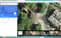
we also analysed locations where there were pavement markings making pathways look like quiet roads, so that we could include roadside scenes and aspects of roadside danger in a safe and careful manner. There were many quiet roads that we analysed within our local town,Leatherhead, especially down Barnett wood lane, Mill lane and Highlands road..however these roads are only almost un-used towards the night so our filming to be particularly safe would have to commence during the night to assure every aspect of safety is considered, and so that no passing cars cause a distraction to our filming or make it seem less realistic in the quiet almost uninhabited setting we want to be perceived.
Tuesday, 1 December 2015
Thursday, 26 November 2015
Film certificate ratings
We analysed film ratings so that we could promote our film towards the most effective audience and designated niche market. Typically horrors are not governed towards any ideal audience under the age of 15. however, the woman in black stands as an exception because it is a historical classic novel that was deemed acceptable by the BBFC in addition to the horror based film 'the hole'. 'The Hole' was accepted as a twelve rating predominantly because of the usage of young upcoming actors featuring in CBBC and CITV programs. We considered making our film a 12 because we wanted the opening to focus on an effective inventive story-line and plot rather than just aspects of horror and scary or gory scenes. If there was actually a moral behind our story it could be classified as a 12 and therfore appeal to a wider and more broadly aged audience..this means we could still include jump scares and possibly disturbing scenes without the usage of strong gore and death. Usually most 12 films are action movies or thrillers, so our movie would be distinctive and we would have to argue our reasons for allowing a horror based thriller to be a 12 certificate. The BBFC state that some horrors may be passed under the 12/12A category with moderate physical and psychological threat permitted along as horror scenes are infrequent with an overall tone that isn't disturbing and infrequent swearing or taboo language or nudity. Also, twelve rated films cannot involve harsh incorrect drug usage or promotion-which our film wouldn't. We were thinking of having a focus in our film on alcohol abuse with a driver involved who acts as if he had been heavily drinking, however we haven't confirmed this idea and need to further work on the age rating for this type of alcoholism.
The most obvious choice for a horror film rating is to aim it at a 15+ audience because this would appeal to teenagers who enjoy the idea of being scared and going to the cinema as a planned event to watch a horror movie. Also a 15+ audience would be more mature and therefore the story-line could touch on different more adult topics. film examiners look at issues when rating a film such as discrimination, drugs, horror themes, imitable behavior, language, nudity, sex and sexual violence and theme. The idea of imitable behavior is a subject to be carefully considered when creating our film because any ideas of danger or violence need to be considered as to what audience we are portraying this to, especially with our idea of the inclusion of roadside issues and reckless driving. Films are also considered under context, tone and impact of how it may make an audience feel; there is also the consideration of the release format- for example if it is released on DVD is there a higher risk of underage viewing. 15 films accept racist, homophobic and discriminatory language as well as strong taboo words and even the strongest language terms like f**k and c**t (depending on manner of use). 15 films are also allowed to include lengthy sexual activity and nudity in a sexual context without strong detail. 15 films also allow strong violence however no dwelling on the infliction of pain or injury, strong sadistic violence is however unacceptable and continually gory films are rated 18s. 15 films allow detailed verbal references to sexual violence for example descriptions of rape or sexual assault in a courtroom scene or in testimony however depiction of sexual violence is not allowed or must alternatively be completely justified in context of the story-line of the film. We know that our horror wouldn't break any of the 15 rating boundaries because there can be strong threat and dark horror as long as there is not a sustained focus on sadistic and sexualised horror and threat- which wouldn't be flaunted at all in our film.
i wanted to research how 18 films differed so wildly from the 15 rating and why you need to be within adulthood for watching 18 movies. when i analysed the film rating, it realized that it was because of inclusions of very strong violence, strong and frequent language, strong horror and sexual activity as well as sexual violence, blood and gore and discriminatory language and behavior. at 18 there is no themes prohibited and adults are free to choose their own entertainment providing the material is not illegal or harmful- this means that this particular categorization for film ratings can even be offensive to adult viewers. Although adults can watch what they want- there is potential aspects that could be cut from an 18 movie if there is material that breaches the criminal law or where material has very detailed portrayal of illegal drug use and sexual and strong violence for example making rape look appealing. Rating a film an 18 cuts out 25% of movie goers as 15% are aged 2-11 and 10% 12-17. This means that by making our movie a 15 we would have a wider audience to promote our film to, as teenagers make up a wide population (at least 8% are 15) and would create more of a broad viewing population & income.
Thursday, 19 November 2015
Horror movie analysis- Drag me to hell
CLIP IS AT: https://www.youtube.com/watch?v=-xPYHygck6o
when we are deflected away from the initial establishing shot, we meet a small family who are pictured to be panicking and scared and immediately attention from the audience is grabbed from the start as we want to know what has happened to the boy. The soundtrack seems to differentiate slightly from a quiet woodwind rendition to the voices of child sopranos (as previously mentioned) which obtains more of a link with our young child character. A tracking shot follows the mother as she runs to the door, in a fast paced motion and we focus on her old fashioned clothing which appears poor and peasant like- immediately feeling slight sympathy for her. the dull colors of her clothing makes her seem un-necessary; possibly foreshadowing the fact we don't actually see her character again after the opening two minutes. The fact that the characters speak in another language shows how times have changed, because although this is set in america- there is an alternative native language to simply 'American'. The different language with sub titles creates suspense and mystery because we do not understand straight away what they are saying. In the shot that i have pictured above, i thought it was effective how the shot is from a eye level angle, however the levels in the scene enable the witchcraft character to be seen as more important and higher up than the family. She therefore, has prevalence in the scene. Shot reverse shots are used to rebound from the Witchcraft woman to the family and back and forth. this allows the audience to feel involved in the conversation. After this shot- we receive an extreme close up of the silver necklace the boy stole, that is the potential cause of the curse he has. such a close up shot reinforces the possible importance of the necklace, and even minor details like the fly that was near the necklace are noticed. The usage of this particular prop means that although there is no antagonist- we see the necklace as a thing of evil- meaning there is possibly a antagonistic character yet to meet. It is often hard for evil to be portrayed through the usage of an actor because sometimes people in horror movies alone cannot be scary without any supernatural appearances or abilities...so it is easier to create an enigma or the idea of an unknown presence using props like relics and antiques that define evil until we finally meet the root of it.
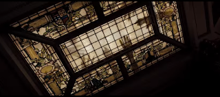 After the witchcraft woman says 'bring him inside' we immediately cut to the boy on a floor inside the house with the filming of how he got inside and to be laying on the floor completely omitted through the use of ellipsis so that the film cuts straight to relevant information that the audience will actually be interested in enabling the plot to follow on and flow freely with only the most relevant of shots and information included. the close up that we receive here of the boys face is close up and framing his expression as he appears terrified and distressed...we can see from the use of makeup in the movie that he is sweating and quite possibly ill and in a bad state. Without having the inclusion of dialogue- this sweat already suggests there is a sense of panic and fear, and sweating in negative situations is something most people can relate to. The way that half the boys face is covered by a blanket- shadowed, whilst the other half reflects the light off his face may possibly suggest a split persona....he stole a silver necklace and is therefore a thief, however he is sorry and youthful suggesting he should not be punished.Alongside the prior soundtrack, there is sounds of heavy breaths and groans alongside the music, as well as the short sharp panicked diegetic sound of the boys breathing. we do not know yet if the harsh heavy breathing the boy hears is a diegetic sound or not- or merely just in his head....however it is still a chilling sound for the audience. The camera cuts to an eye-line match of
what the boy can see above him- a light window with the shadows of many hands overlaying it. The camera films this in a particular way to make it seem even more uneasy so canted angles are used as the camera tilts and slowly spins almost as if the boy is drifting off to another darker place- hell, or that he is caught among a cyclic daze- causing him to almost hallucinate. The spinning in the scene suggests dizziness and the way that the light is used so we can only see the window highlighting the dark shadow hands makes the audience unaware and scared about what else lingers outside and even near the window. Shot reverse shots of the boy then the window, then the boy again create a prominent link between both shots...whether this is relational editing and both are unsettling sights or both breathing heavily, or just editing to show us exactly what the young boy is seeing. A Foley artist most probably created the non diegetic screeching sounds used in the scene and it almost sounds as if a door is opening- foreshadowing the under world opening up to take the boy in the next minute of the scene. the sounds are almost painful to listeners and create an experience that involves the audience more.The surroundings around the boy are dark, as if he is in a night-time shadowed, dark environment, however lighting still enabled the audience to see the sweat and panic reflecting off his face. For my own movie, being a horror- i wanted to use darkness and night-time environments, so i need to focus on using effective lighting just like this so that it still appeared realistic and dark.....this is why to the right- i have included a video tutorial i watched to help with lighting techniques and filming methods for shooting in the darkness.
It is effective that at 1;22 there is a shot of the mothers hands embracing her sons as there is a clear contrast here between the shadowy, almost fantasy hands highlighted in ceiling window, and the real raw hands of the mother. The hand imagery creates an important relationship and link and hands can be connoted with grabbing, taking, holding, grasping and hanging onto...and we can see that the boy is hanging onto life whilst hell is attempting to take him. The close up that frames this loving body language enforces this effect...however we see the hands of hell from a low angle, looking up on them showing their domineering power, however the mothers hands are looked down on from a high angle- reinforcing how feeble and powerless they are. A few seconds later, the woman displays an expression of recognition and we see her look to the side as an eye line match shot confirms what she is looking at-the witchcraft woman. At 1;34 the doors blast open from an invisible force, and the effect of this plays a role in scaring the actual external audience more than the characters, who have worse to come. At this point, camera editing techniques have played a role in almost warping the appearance of the strewn doors as if the force from hell has the power to do anything. Doors typically break and splinter if hit hardly, not bend- so this reinforces the supernatural basis of the film and rather unreal scenes. At this point- a loud definite sound effect accompanies one of the loudest and lowest pitched droning parts of the opening scene, making its prominence more noticeable. The loud pitched diegetic scream the boy makes is a typical convention of horror movies having such a high pitched chilling scream, especially being from a child makes the audience feel pity for the state of the young child even more. The close up shot used here frames his terrified expression as he screams. The long shots of the havoc in the room where the family are shows the adverse external effect of the boys curse, and the wind in the inside homely environment is almost showing how nature has power, and plays on pathetic fallacy with the wind almost being like the breaths from the creatures of hell- exceptionally powerful. The usage of props such as windows and shutters being blown shows how this entire scene is completely un natural and atypical as usually the wind comes from outside not inside. Also, the shutters show how something that should be kept out and and not seen is completely playing against that idea.
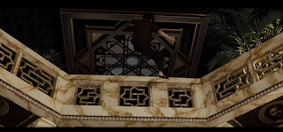 At 1;42 a match action shot that tracks the boy as he sprints away is used. the action is matched because we see the boy get off the floor and begin to run from a side view and a relatively long shot which then changes with a clean cut to a mid shot from behind him. The sound effects to accompany this are very clear and defined with no background or non diegetic noises and even the sound of the boys shouts are slightly muffled. We can hear, defined, as if right next to the camera- the sound of growling and grunting and the camera films as if it is handheld-filming from the perspective of another person or source. This could be considered a point of view shot as the boy repels the camera as if it is a force of person he has to resist. This shot could be considered ineffective because it is almost dissociating the audience from the boy because he wants to be away from the camera/point of view and therefore runs from it. At 1;47 another match action shot is used to film the boy as he is picked up and strewn onto the floor, we first see this action from a frontal view-eye-level- which then dis orientates the audience by filming from a behind and low angle view as we see the boy fall to the ground. This low angle is effective as it shows the height the boy has fallen from. effectively, the sound of growling that seemed close to the camera dissipates when the boy is filmed from another angle. The source of the noise- the antagonistic force- was what picked the boy up...and when the deed is done, we can no longer hear the noise. This shows the importance of sound usage in movies because we don't get to see the source of evil we only hear it so without sound we would have no idea what was there as the audience have no hints at the appearance of the creatures of hell until later on in the movie. By keeping the visuals of the horror characters secretive, an ongoing enigma has been created.
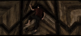 The camera tracks the woman as she leans over the balcony to look at the bottom floor and this tracking shot is fast paced to represent her panic, the camera tilts to a canted angle to show her leaning which is reinforced by the diegetic sound of fast paced breathing. breathing pays a prominent role in the opening two minutes of the film because although we would associate breathing with life-it can also be associated with the invisible antagonistic force and with panic and disorientation. we see an eye-line match as the woman sees the boy below her and there is almost a plot twist as we see that this boy appears dead from his twisted body posture however seconds later it appears that he isn't. The camera without any prominent editing cuts straight back to the reaction of the parents when they see their son, and the mid shot frames the the reactions even more especially with the wind blowing back their hair so all that is framed is the emotion change. Having all three of them in the shot shows a difference in emotion-not just the cliche sadness....there is also confusion shown by the father and disorientation by the witchcraft female. The high pitched diegetic scream of the mother is not distorted or distracted by any other external diegetic or non diegetic sound.
As the boy awakens a shot looking down on him from a high angle, possibly belittling him or showing his small amount of power in the power that is to come is used which cuts to an eye level view shot closer up of him attempting to get up. alongside this, a score that builds in volume and pace begins to play- sounding almost synthetic as a backing soundtrack to the movie. When the woman shouts above him we see that the boy is almost confused at what is going on, and just as we do not fully understand her language, he does not fully understand his situation. The soundtrack is completely inaudible when the floor cracks open and diegetic sound of it opening up is prominent.The camera at this point stays in a similar position, as if it cannot escape just as there is no way out for the boy. the use of lighting is interesting here because although the boy is to be taken to the dark hell ridden underworld, there is a fiery warm light seeping through. the light is warm because it looks like fire flares and it engulfs the area around the boy. we know this would not literally happen, so begin to recognize at this point that the film has a more supernatural mythical basis.
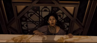
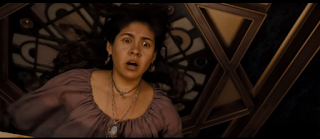 in the finale or climax of the ending part of the first scene, the boy gets dragged almost into the pits of hell. I thought it was clever how shadows were used to show the action, which would be a technique we could incorporate into our own movie as this would be easy to accomplish and special effects editing software wouldn't be required. Many of the other special effects in the movie were created using green screen, puppets, prosthetic's and CGI. The camera tracked up to see the woman's reaction, and the light from below illuminated her scared expression. Peter Deeming, one of the directors tried to use realistic lighting in the film...he said 'normally you'd put all color corrected bulbs in but we went with what was there including shots in the street as well as interior lighting' to in this way make the film itself seem even more realistic. The musical score for this part of the opening scene began to be more like the sound of an organ and was loud, a very low pitch and the sounds of childish screams or childish operatic noises accompanied the synchronous soundtrack. when the film ends with dialogue of 'we will meet again' in an archaic language, the audience is left in anticipation of when the woman returns in vengeance. there is a immediate cut from this to the title scene of the film with 'drag me to hell' in a chilling almost 'boney' looking font. this particular font inspired me for my own film because it seemed almost old and like a calligraphy font which fits more with the horror genre and how things that occur in the past have a higher potential to be scary.
I chose to analyse the opening sequence for 'Drag me to hell' because the film is a successful blockbuster that grossed over $90 million worldwide as well as winning the award for best horror movie in 2009 at the scream awards and the 2010 Saturn awards. This reinforced the success of the movie and made it evident that i should use this particular horror as inspiration for my own, as i want to make my horror movie opening engrossing and successful. The directors, The Raimi brothers wrote and directed the movie and Ivan Raimi also worked on the spider man films- i thought this showed a prominent interrelation between action and horror.
The movie opens with an establishing shot of the location. Horror movies typically don't begin by jumping straight into the action or plot- instead we meet our protagonist or begin to relate to characters. Typically 'normal' home environments, relationships and friendships are depicted. however, here although the audience may presume we are to be entering the internal environment of a picturesque looking mansion building with palm trees flaunting the exotic location and the broad daylight suggesting nothing can scare the audience as of yet......the audience are wrong. The establishing shot of this seemingly pleasant and quiet residence creates a huge contrast with what actually is about to happen there- and the plot starts rolling straight away without any distractions or even getting to know characters. The establishing shot is effective to have right at the beginning much like many movies to show where the action is about to take place...other movies i have researched either use this same technique or completely contrasting- use the technique of a close up or extreme close up to begin a movie so the audience either learn and appreciate the location, or are led to uncover what and where the movie begins. The daylight usage in this movie is effective because usually artificial lighting is brighter than outside at this time of day- however here, the outside seems more pleasant, naturally lit and light, than the darkness of the internal house where the dark happenings proceed. The way the house is framed in the shot by trees possibly suggests the area is more rural, and nobody is near or able to help with anything that goes on. This rural setting of a horror movie is a common convention of the genre- in movies like scream, the hills have eyes, the strangers and many more- the going-ons that proceed in the house are so far from anyone else or any urban areas so nobody is able to help, rescue or 'hear the screams'. The establishing shot remains still for a few seconds and then the camera moves downwards. the soundtrack accompanying the shot is a soft melodic theme, sounding almost like woodwind instruments. this reinforces the weather conditions at the location, because the leaves rustling slightly suggest it is windy too. The Rendition could possibly be seen as a ghostly sound, and it is quite quiet in comparison with the sounds in forthcoming scenes. The Drag Me To Hell soundtrack was actually composed by an artist named Christopher Young- who has worked with the directors of the film previously so had a close relationship and understanding of his composition. Young said that emphasis was on 'using the soundtrack to create a world that didn't exist', a world of the supernatural. this means the score contains lots of un-natural, not in sync slow high pitched sounds to create an uneasy feeling. There is a particular usage in the movie of childlike soprano vocals that have a prominent part in the soundtrack...i thought this was an effective idea to inspire my own movie soundtrack as often children's ghostly voices can create a chilling feel. In the first few seconds, as well as the audience being aware of the location, the caption in the right handed bottom third of the screen tells us the film is set in California 1969. This creates a relevant contextual meaning to the film, and the audience may bring in their own knowledge of the witch hunts and conspiracy in old-time america which have a relevance in the film. also, the date makes it evident that this is either a flash back that will have a further meaning to the rest of the film-or that simply the film has a historical basis- much like films like the woman in black. Once again- i was inspired by this idea of setting movies in the past, because the past is not always 100% factual and known....events can be interpreted in many alternative ways and it is easier to create a plot based in old times and support it with roughly relevant history to make the entire plot seem more belivable and withholding some aspect of truth.when we are deflected away from the initial establishing shot, we meet a small family who are pictured to be panicking and scared and immediately attention from the audience is grabbed from the start as we want to know what has happened to the boy. The soundtrack seems to differentiate slightly from a quiet woodwind rendition to the voices of child sopranos (as previously mentioned) which obtains more of a link with our young child character. A tracking shot follows the mother as she runs to the door, in a fast paced motion and we focus on her old fashioned clothing which appears poor and peasant like- immediately feeling slight sympathy for her. the dull colors of her clothing makes her seem un-necessary; possibly foreshadowing the fact we don't actually see her character again after the opening two minutes. The fact that the characters speak in another language shows how times have changed, because although this is set in america- there is an alternative native language to simply 'American'. The different language with sub titles creates suspense and mystery because we do not understand straight away what they are saying. In the shot that i have pictured above, i thought it was effective how the shot is from a eye level angle, however the levels in the scene enable the witchcraft character to be seen as more important and higher up than the family. She therefore, has prevalence in the scene. Shot reverse shots are used to rebound from the Witchcraft woman to the family and back and forth. this allows the audience to feel involved in the conversation. After this shot- we receive an extreme close up of the silver necklace the boy stole, that is the potential cause of the curse he has. such a close up shot reinforces the possible importance of the necklace, and even minor details like the fly that was near the necklace are noticed. The usage of this particular prop means that although there is no antagonist- we see the necklace as a thing of evil- meaning there is possibly a antagonistic character yet to meet. It is often hard for evil to be portrayed through the usage of an actor because sometimes people in horror movies alone cannot be scary without any supernatural appearances or abilities...so it is easier to create an enigma or the idea of an unknown presence using props like relics and antiques that define evil until we finally meet the root of it.
 After the witchcraft woman says 'bring him inside' we immediately cut to the boy on a floor inside the house with the filming of how he got inside and to be laying on the floor completely omitted through the use of ellipsis so that the film cuts straight to relevant information that the audience will actually be interested in enabling the plot to follow on and flow freely with only the most relevant of shots and information included. the close up that we receive here of the boys face is close up and framing his expression as he appears terrified and distressed...we can see from the use of makeup in the movie that he is sweating and quite possibly ill and in a bad state. Without having the inclusion of dialogue- this sweat already suggests there is a sense of panic and fear, and sweating in negative situations is something most people can relate to. The way that half the boys face is covered by a blanket- shadowed, whilst the other half reflects the light off his face may possibly suggest a split persona....he stole a silver necklace and is therefore a thief, however he is sorry and youthful suggesting he should not be punished.Alongside the prior soundtrack, there is sounds of heavy breaths and groans alongside the music, as well as the short sharp panicked diegetic sound of the boys breathing. we do not know yet if the harsh heavy breathing the boy hears is a diegetic sound or not- or merely just in his head....however it is still a chilling sound for the audience. The camera cuts to an eye-line match of
what the boy can see above him- a light window with the shadows of many hands overlaying it. The camera films this in a particular way to make it seem even more uneasy so canted angles are used as the camera tilts and slowly spins almost as if the boy is drifting off to another darker place- hell, or that he is caught among a cyclic daze- causing him to almost hallucinate. The spinning in the scene suggests dizziness and the way that the light is used so we can only see the window highlighting the dark shadow hands makes the audience unaware and scared about what else lingers outside and even near the window. Shot reverse shots of the boy then the window, then the boy again create a prominent link between both shots...whether this is relational editing and both are unsettling sights or both breathing heavily, or just editing to show us exactly what the young boy is seeing. A Foley artist most probably created the non diegetic screeching sounds used in the scene and it almost sounds as if a door is opening- foreshadowing the under world opening up to take the boy in the next minute of the scene. the sounds are almost painful to listeners and create an experience that involves the audience more.The surroundings around the boy are dark, as if he is in a night-time shadowed, dark environment, however lighting still enabled the audience to see the sweat and panic reflecting off his face. For my own movie, being a horror- i wanted to use darkness and night-time environments, so i need to focus on using effective lighting just like this so that it still appeared realistic and dark.....this is why to the right- i have included a video tutorial i watched to help with lighting techniques and filming methods for shooting in the darkness.
It is effective that at 1;22 there is a shot of the mothers hands embracing her sons as there is a clear contrast here between the shadowy, almost fantasy hands highlighted in ceiling window, and the real raw hands of the mother. The hand imagery creates an important relationship and link and hands can be connoted with grabbing, taking, holding, grasping and hanging onto...and we can see that the boy is hanging onto life whilst hell is attempting to take him. The close up that frames this loving body language enforces this effect...however we see the hands of hell from a low angle, looking up on them showing their domineering power, however the mothers hands are looked down on from a high angle- reinforcing how feeble and powerless they are. A few seconds later, the woman displays an expression of recognition and we see her look to the side as an eye line match shot confirms what she is looking at-the witchcraft woman. At 1;34 the doors blast open from an invisible force, and the effect of this plays a role in scaring the actual external audience more than the characters, who have worse to come. At this point, camera editing techniques have played a role in almost warping the appearance of the strewn doors as if the force from hell has the power to do anything. Doors typically break and splinter if hit hardly, not bend- so this reinforces the supernatural basis of the film and rather unreal scenes. At this point- a loud definite sound effect accompanies one of the loudest and lowest pitched droning parts of the opening scene, making its prominence more noticeable. The loud pitched diegetic scream the boy makes is a typical convention of horror movies having such a high pitched chilling scream, especially being from a child makes the audience feel pity for the state of the young child even more. The close up shot used here frames his terrified expression as he screams. The long shots of the havoc in the room where the family are shows the adverse external effect of the boys curse, and the wind in the inside homely environment is almost showing how nature has power, and plays on pathetic fallacy with the wind almost being like the breaths from the creatures of hell- exceptionally powerful. The usage of props such as windows and shutters being blown shows how this entire scene is completely un natural and atypical as usually the wind comes from outside not inside. Also, the shutters show how something that should be kept out and and not seen is completely playing against that idea.
 At 1;42 a match action shot that tracks the boy as he sprints away is used. the action is matched because we see the boy get off the floor and begin to run from a side view and a relatively long shot which then changes with a clean cut to a mid shot from behind him. The sound effects to accompany this are very clear and defined with no background or non diegetic noises and even the sound of the boys shouts are slightly muffled. We can hear, defined, as if right next to the camera- the sound of growling and grunting and the camera films as if it is handheld-filming from the perspective of another person or source. This could be considered a point of view shot as the boy repels the camera as if it is a force of person he has to resist. This shot could be considered ineffective because it is almost dissociating the audience from the boy because he wants to be away from the camera/point of view and therefore runs from it. At 1;47 another match action shot is used to film the boy as he is picked up and strewn onto the floor, we first see this action from a frontal view-eye-level- which then dis orientates the audience by filming from a behind and low angle view as we see the boy fall to the ground. This low angle is effective as it shows the height the boy has fallen from. effectively, the sound of growling that seemed close to the camera dissipates when the boy is filmed from another angle. The source of the noise- the antagonistic force- was what picked the boy up...and when the deed is done, we can no longer hear the noise. This shows the importance of sound usage in movies because we don't get to see the source of evil we only hear it so without sound we would have no idea what was there as the audience have no hints at the appearance of the creatures of hell until later on in the movie. By keeping the visuals of the horror characters secretive, an ongoing enigma has been created.
 The camera tracks the woman as she leans over the balcony to look at the bottom floor and this tracking shot is fast paced to represent her panic, the camera tilts to a canted angle to show her leaning which is reinforced by the diegetic sound of fast paced breathing. breathing pays a prominent role in the opening two minutes of the film because although we would associate breathing with life-it can also be associated with the invisible antagonistic force and with panic and disorientation. we see an eye-line match as the woman sees the boy below her and there is almost a plot twist as we see that this boy appears dead from his twisted body posture however seconds later it appears that he isn't. The camera without any prominent editing cuts straight back to the reaction of the parents when they see their son, and the mid shot frames the the reactions even more especially with the wind blowing back their hair so all that is framed is the emotion change. Having all three of them in the shot shows a difference in emotion-not just the cliche sadness....there is also confusion shown by the father and disorientation by the witchcraft female. The high pitched diegetic scream of the mother is not distorted or distracted by any other external diegetic or non diegetic sound.
As the boy awakens a shot looking down on him from a high angle, possibly belittling him or showing his small amount of power in the power that is to come is used which cuts to an eye level view shot closer up of him attempting to get up. alongside this, a score that builds in volume and pace begins to play- sounding almost synthetic as a backing soundtrack to the movie. When the woman shouts above him we see that the boy is almost confused at what is going on, and just as we do not fully understand her language, he does not fully understand his situation. The soundtrack is completely inaudible when the floor cracks open and diegetic sound of it opening up is prominent.The camera at this point stays in a similar position, as if it cannot escape just as there is no way out for the boy. the use of lighting is interesting here because although the boy is to be taken to the dark hell ridden underworld, there is a fiery warm light seeping through. the light is warm because it looks like fire flares and it engulfs the area around the boy. we know this would not literally happen, so begin to recognize at this point that the film has a more supernatural mythical basis.

 in the finale or climax of the ending part of the first scene, the boy gets dragged almost into the pits of hell. I thought it was clever how shadows were used to show the action, which would be a technique we could incorporate into our own movie as this would be easy to accomplish and special effects editing software wouldn't be required. Many of the other special effects in the movie were created using green screen, puppets, prosthetic's and CGI. The camera tracked up to see the woman's reaction, and the light from below illuminated her scared expression. Peter Deeming, one of the directors tried to use realistic lighting in the film...he said 'normally you'd put all color corrected bulbs in but we went with what was there including shots in the street as well as interior lighting' to in this way make the film itself seem even more realistic. The musical score for this part of the opening scene began to be more like the sound of an organ and was loud, a very low pitch and the sounds of childish screams or childish operatic noises accompanied the synchronous soundtrack. when the film ends with dialogue of 'we will meet again' in an archaic language, the audience is left in anticipation of when the woman returns in vengeance. there is a immediate cut from this to the title scene of the film with 'drag me to hell' in a chilling almost 'boney' looking font. this particular font inspired me for my own film because it seemed almost old and like a calligraphy font which fits more with the horror genre and how things that occur in the past have a higher potential to be scary.
Thursday, 12 November 2015
Film CREDITS analysis- Opening of World War Z
from 0;29 onward, we begin to see people- or more importantly- life. This is important because we firstly see people doing normal activities, walking, talking, embarking trains, cycling.....which completely contrasts with how we see later on in the movie introduction how there is a infection causing zombie like behavior. As we see life, we also hear the non diegetic narrative from TV news programmes, overlapped in a montage of different spoken news headlines, this suggests urgency and the formal received pronunciation accent makes it easy for the audience to straight away understand some of the key issues affecting this dystopia. After the human orientated clips, from 0:44 there begins to be a focus on animals, and through different editing techniques- entire establishing shots such as the bird ridden sky contrast with extreme close ups and less revealing, disclosed shots like the ant colony. All of these animals are shown in groups, reinforcing togetherness- and fighting an antagonistic force together. It also represents nature and how natural intentions and reflexes cause dependency upon others.
At 0;53 there is a short clip in the montage from the 'Oprah' integrating the theme of social media and the power of technology and celebrity over the public. this links into the way animals and humans have been portrayed in groups because celebrities like Oprah have huge influence and status- with large groups following her and a large amount of power. this almost foreshadows how only somebody with a status and power can be followed...and that people have to independently fight things (like the zombie/rabies disease in the film). The way that the camera shot almost seems like a re-used clip from Oprah's show suggests how there is global involvement, it also makes this montage at the start of the film seem more informative as we are receiving information from a key TV personality. the quality of the filming is almost 'grainy' as if we are not seeing the full quality or picture however the mid shot used to frame Oprah is purposeful to ensure we notice who she is.
0;56 is one of the most prominent inclusions in the montage because it is the first time the sound becomes diegetic and matches the narrative with the imagery- almost as if it is a full clip extracted from a news broadcasting company,infact in this case-HLN news. We hear a urgent voice inform the audience about stranded dolphins, which reinforces ideas of purpose being to inform because informing is the key convention of news channels. The banners and graphology techniques displayed on screen almost make the clip seem interactive, as if we the audience can do something about it- or more, act as a warning for our future. Alongside the narrative, the clip of stranded dolphins is upsetting and is a long shot showing the beach location as well as the animals. After the beach scenes we had seen previously in this pre-film montage...it is evident there is a clear contrast in how we feel about the beach as an audience and the inclusion of both contrasting clips could be a representation of how things are so easily subjective to change- as we know our environment is currently with huge issues of global warming etc. The usage of natural daylight in this shot reinforces how nothing is hidden or in the shadows and typically a slaughter of humans would be seen as a dark shady crime, however the death of these animals seems almost casual, obvious and prominent. There is a close up shot used to frame Piers Morgan on a fully black screen whilst he is in the left hand third of the screen talking about CO2 emissions. once again, having a character of fame, intellect and reputation reinforces the severity of this film, almost making the audience feel as if it is real and the 'magic' of the film stay alive. The narrative of Piers Morgan alone would be recognizable, however we see him represented in a suit on screen- once again showing the serious nature of the concerning issues about our environment. It can be rather ambiguous to base a film on the state our world could get into because there are cliche views concerning dystopian ideas continually based on for movie making, however this particular film creates a link with a modern audience and modern audience views and ideas...and uses this link to create an enigma about what could have got the world into that state.
one of the editing techniques that inspired me regarding the creation of my own movie was at 1;10 where a transition overlaps four shots captured from four different angles so that it exaggerates the situation of traffic to be worse than it is. The traffic jam these clips of film are showing is going in one way (much like the movement of the shots) but the cars are almost displaced and look stuck ( like the angles the shots are taken from and the almost warped presentation of them on screen). In my own movie i could incorporate this manner of editing, by over lapping 4 shots from different distances or angled to create a warped, uneasy feel in a scene. I researched this technique in the world war Z opening montage and trialed this technique using the 'how to' video below.
the directors have in some places used irrelevant film footage almost to create a casual or more authentic appeal. for example at 1;10 there is a clip of socks and heels and a woman remarks as a digeteic narrative 'your socks are so cute'. this video seemed hand held and was most probably a representation of a home video, something too that the audience can relate to. At 1;23 we begin to see more of the human effect that this futuristic world has caused, and people in masks and large expanses of people filmed from high angled shots in queues and crows belittle them. About ten seconds later, The soundtrack of Muse's 'isolated system' picks up in both volume and pace, and begins to sound less like a piano rendition but more synthetic and futuristic, showing the change in time periods this montage has taken us through- almost like the ellipsis editing technique. We also see parallel cuts in the editing where there is film of two completely different situations that keep cutting in at different points- for example we see a wolf growling, then a man warning about Domesday, then this same wolf devouring another animal, and then an extreme close up of our previous man. This is also considered as relational editing because both subjects link- the wolf is showing no mercy to its play- whilst the world and coming 'Domesday' shows no mercy to its people. After this, there is following clips of food chain activities and cannibals eating their prey...this could be creating a foreshadowing animistic link to the films plot with humans preying on other humans. the footage seems as if it is taken from a documentary, and will lead viewers to feel scared and disturbed emotions so they can relate more easier with the forthcoming characters in the film.
finally, as the montage comes to an end- it is evident that all of the warped editing and limited shots showing only sections of imagery was actually different scenes embedded inside letters of the words 'WORLD WAR' and entire screen pans out to reveal this title as the soundtrack reaches its climax and then begins to fade out.
Subscribe to:
Comments (Atom)


