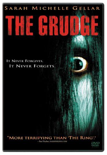
 The Film 'the grudge' acted as inspiration for us firstly because of its plot revolving around a young deceased and very eerie looking girl- often depicted with hair strewn across her face, as we wanted to adopt for our female in the film. Also, the camera 'magic' with shots that cleverly filmed the grudge girl behind characters so only the audience saw, or in mirror imagery or appearing to appear then disappear were all techniques we wanted our film to adopt. The movie posters and DVD cover wallets were of particular inspiration to us because of the clear horror theme especially with the chilling color choice. When designing a title for our film, we analysed how the deep red in the title conveyed connotations of blood, pain and danger- highlighted on the shadowy dark background which associates with the darkness in our own film. For this reason, we thought a bold red statement title much like this would stand out in our video and would clearly and boldly overlay the video. We also thought the title here for a movie revolving directly around a young girl was appropriate to our film too because our film entitled 'Robyn' is the name of our main character. The font style for this particular film is gritty and almost edgy..making it seem almost ancient and old. This more historic feel does not fit in with our film basis because we wanted to create more of a relatable and modern feel to our film, set in our age with technology like our main prop- a car. The capitalization of all the letters makes the title appear prominent and attention catching. It also almost entitles and defines the young grudge girl...which we aim for our film additionally to do. When the grudge film actually begins, the title prominently appears on the screen without a fade in- so it looks important and there is a sense of fear and urgency, however the fade our shows this fear dissipating. We wanted to adopt a transition like this for our own movie and suggested a red title would be appropriate because it would foreshadow the blood and catastrophe yet to see in the movie opening and still withhold the boldness.
The titling of the ring stood out to us when attempting to create a movie title and transition for it because we thought the ring title was original from most other gritty and chipped looking horror movie titles, and the title still appeared eerie even without the presence of shocking and scarlet red colors. the faint glow around the title is similar to the glow of the headlight we wanted the title to overlay and the font looks childlike and rough- with its childlike nature linking to the girl in our movie, and the rough look linking to the accident that occurred with the 'rough' looking male who had been drunkenly driving. For this particular movie title, a filter and overlay was applied to give meaning to the title- in this case TV grains relating to the TV screens where the grudge girl escapes from. For our own title, we thought a flashing overlay would reflect the headlights of the car. The title itself of this movie inspired us because it barely gave anything away- which is what we want our movie to achieve so that audiences would be held in suspense and anticipation of what the movie withholds. the purposeful omitting of any capital letters made the film seem even more child based- which creates an eerie feel.


Historically, the majority of horror movies adopted similar or identical font styles for titles, that appeared almost gruesome or had almost a pop/quirky feel. titles too that gave away themes- for example the 'Swamp Thing' with its swampy, muddy looking font gave direction to viewers of what the plot would revolve around. Nowadays- all different fonts are used to separate horrors from each other regarding sub-genre, scariness and type. In our movie opening, we aim to distance our font and title as far possible from the likes of these because of the modern focus of the movie- due to the car prop and modernly dressed male actor. We also aim to include more color in our movie opening- to reinforce its mainstream horror sub-genre and realistic nature.
No comments:
Post a Comment