Monday, 28 March 2016

film voiceover


Voice over:
Our film commences with a production credit featuring our conceived institution- BLACKWIND PICTURES. The appellation ‘BLACKWIND PICTURES’ is conventional of typical horror distribution companies linking to the likes of twisted pictures with its name, and Blumhouse pictures with its grunge monochrome colour scheme. The smear transition and sound motif alongside the institution reinforce the company’s prominence in distribution, an intent we would have for any genuine company independently distributing our film.

A black screen instigates our film, conventional of the majority of horror movies because it gives a pause for the audience to detach themselves from the reality of the real world with the titles and institutions and encase themselves within the fictional world of our film.

The first accreditation for an actor in our movie appears just after a match action shot after our protagonist has descended from the car. The font style remains constant throughout and fits in with the horror colour connotations using only white representative of ashen, morbidity and shallowness. The credits we use also have limited screen time to ensure they do not disrupt our films continuity.

Our favoured camera shots are those that depict the young girls blood stained face- framed twice in our opening with close up shots; one following an eye line match which creates a relation with the characters even more. We especially liked these particular shots because conventionally they pose links to other similar horrors like Annabelle, Orphan and Carrie which use the same camera techniques. The gruesome makeup used as part of mise en scene for the young girls face was curated with a cheap technique, further enforcing the small budget of our independent film aiming to still potentially create a large budget inspired by similar films such as Paranormal activity or attack the block.
 

Some of our credits used appear straight after dramatic moments of the opening such as the girl’s face being seen for the first time, the man walking away from the crime scene intentionally to give eminence and accreditation to the producers, actors and distributers for the intense prominent film and its key moments.

Throughout the film, a chilling ambient sound plays-reinforcing the disturbing conventional atmosphere and giving the film depth. The ambience sounds as if the filming takes place in a desolate area where the sound of the wind is protuberant which is further coincided thuds that give the girls actions and parts of the film focused distinction.

For the scene where our antagonist male is in the car, a warped radio tune hums in the car which is similar to ‘tiptoe through the tulips’ used in Insidious as a unnerving rendition. This diegetic sound links the man in the film with reality whilst the non-diegetic yet synchronous thuds that follow the girls actions separate her from reality and make her presence feel almost unreal and unsettling.

Our purposeful use of natural lighting and the transition in the film from light to dark as an ellipsis of time has been used almost reinforces the transition of life to death for the young girl…a process considered conventionally in many horrors. The darkness also adds shadows to our movie, and by not using artificial lighting and spotlighting our film maintains a more convincing feel.

The technique of assembling our movie opening so our film title comes right at the end imposes further that this opening is designated to be the introduction to a similarly themed course of events throughout the full length movie. Also, it keeps the audience in anticipation throughout…building up tension for the name of the girl and the titles purpose to be revealed. The soundtrack used alongside the title exposure is warped childish music fitting with the child horror based course of events, this music would be a recognisable sound that defines our film and would potentially be used in the trailer as well as the movie itself

Sunday, 27 March 2016

film annotations

This short clip is a re-upload of our movie with annotations depicting connotations, direct denotations, ideas of themes and conveyed meaning and general technical elements concerned with our film. We thoroughly annotated the whole movie including the production credits to allow the annotations to directly associate with what is happening on screen in every scene of the film. We created our annotations using the youtube annotations tool which was simplistic to use, rather than adding text in credits form using adobe premier elements.

EVALUATION ACTIVITY 6 What have you learnt about technologies from the process of constructing this product?

KIT WE USED

Nikon camera& Olympus pocket camera:
what I learnt from using it:
when filming, we used one main camera- a Nikon L810, however when we were aiming to film with a handheld, more uneasy or canted angle technique we used a subsidiary camera of a typical pocket camera- an Olympus VG-160. The L810 is a bridge camera, with high resolution and HD and aimed at camera buyers who want a high quality visual, with ease of working it. The camera is not designated for movie filming, hence one of its setbacks is the fact that the sound quality is very poor, however for our film it conveniently captured the scenes we wanted and was easily maneuverer and used with the tripod. another set back of the camera was that it did not have the optional choice function of having an on screen grid which we could have used to help keep to the rule of thirds when filming...however when in the editing process we ensured we stuck to the rule of thirds on the computer. a 3/3 or 9/9 grid on screen would have helped us in filming to ensure we didn't ruin continuity of our film or alter any scene geography. yet another camera technology fall-back was the fact that our camera did not have simplistic aperture or saturation effects to help with the lighting that was highlighting shots in our film. The Nikon L810 includes special features that we experimented with during filming for example its 2FPS continuous shooting and panoramic features, auto focus on film
IPhone 6&6S:
what I learnt from using it:
Although we didn't use phone technology for filming the movie footage itself we ensured we always had an easy method of capturing movie making diaries and any brief interviews with a phone. We also used iPhone cameras because of their 6mp cameras to create panoramas of our location prior to filming, and time lapses of some of our scenes to work with specific frames. With our ambitious intentions for our film, we feel this mobile phone involvement in the filming process would contribute to a marketing campaign for our film because typically film marketing and distribution is now integrated on many vertical media platforms many of which are accessed through mobile social media sites. By posting video diaries, bloopers and behind scenes footage from our iPhone we would grasp a larger audience who would be able to gather an insight about what goes on behind the scenes in a less formal and impersonal level like the movie itself. Our iPhone usage is also showing how by using a simplistic piece of technology like a phone which the majority of people poses- you can be involved in the whole movie making process and share similarities between audience and producers. also, our movie diaries- especially if more frequently posted on our blog would build anticipation and suspense.


tripod:
what I learnt from using it:
the tripod we used was the easiest piece of new technology we had to learn to use for our movie development..after completing our preliminary tasks we were used to how to manoeuvre the tripod and use its levels and levers to our best advantage.

computer:
with instalment of Adobe premier elements, availability of internet access for BLOGGER, YOUTUBE, MOVIE MAKER:
what I learnt from using it:
we have used a variety of computer software in both the production and distribution process of our movie. Firstly- in film production we primarily used Adobe premier elements which we used as the foundation software for our film. The adobe package is the 10th edition with features that made typical editing simplistic. one of the key advantages of this particular software with the frames in a lengthy timeline of our movie because having it split into small frames made it easier to visualise the scenes and fit cuts and editing techniques in. Also, when you wanted to make a cut- a double parallel visual of the following scene came up on screen so you could fit editing exactly to the next scene in order to follow rules of continuity. also a further advantage of premier elements was its difference in comparison to less advanced film making packages in particular moviemaker which I had prior movie editing experience with before. Movie maker has many less effects, transitions, options with sound editing and ability to create variations of cuts.  However, we did use movie maker for more simplistic tasks in our movie making production for example when adding annotations to some of our interviews and using movie maker to edit one of our preliminary tasks to see the difference between advanced and less advanced editing software. In the production process as well, we had to discover fonts and for this used the software '1001 horror fonts' where we found the diedie font that we edited to create the perfect font for our movie with the ability to alter its colourings, saturation, size, style, capitalisation and boldness. Instead of using the availability of fonts on word and Microsoft software we thought this would be more effective because it gave a wider range and variety of text choices. In the production process we also used the YouTube to mp3 software which helped us manoeuvre non copyright online sounds into mp3 files that we could transfer into our movie. YouTube to mp3 was effective because of its fast speed of file transferral, however the only issues we encountered was when some of the mp3 file http addresses didn't work.

In the distribution process of our film we used the software YouTube which is one of the internets most frequently used search engines and most popular video media viewer. YouTube can also be downloaded on windows as an app and even on mobile devices as an app which allows you to watch video clips, share videos and follow and subscribe to short film making channels for example warp films, music video pages such as MTV, blogging pages such as zoellas makeup channel etc. this made YouTube the perfect place to upload our movie opening as well as our interviews and presentations as in addition to its ease of use it is also easy to use YouTube to distribute movies further to other software for example in our case- Blogger. We uploaded onto YouTube also our animatic, so in the end we had a range of YouTube footage which would attract audiences interested in the whole movie making process. Other features of creating our own YouTube channel was that people can subscribe to our channel (although as of yet we have not promoted our page enough to get subscriptions) as well as the software enabling people to 'like' 'dislike' and 'comment' on our movie which is an effective way to gather audience feedback and response. Using YouTube as a method of distribution was a key part of our movie making process because we followed the lead of other popular movie distributors whereby movies such as lord of the rings and divergent were promoted via YouTube with video diaries, teaser trailers and short interviews. By sharing our YouTube videos on other sites such as blogger, our own social media profiles and various other integrated platforms an echo chamber effect is created. In addition to YouTube as a method of distribution the 'blogger'/'BlogSpot' software allowed us to post research, analysis, filming diaries and revision. Blogger was a key participant in enabling us to publish our media studies journey and maintain all of our research and information in once place. Keeping all of our coursework on one online profile was also easy and convenient to use, and accessible on our phones and tablets so the blogging process was of ease to us.


go pro (for trial& prelimary tasks and location shots):
what I learnt from using it:
we didn't learn or develop our understanding excessively with the go pro camera we used because we didn't actually use it for the final cuts of the film, and didn't end up filming any footage with this camera because we thought it was unconventional of horror movies to use such a high resolution high tech camera that was meant to be free handled not put on a tripod. with our research we found out that go pros tend to be used more in action and sport based movies as the go pros main purpose as a general high priced camera is to shoot sporting and underwater action. We did however shoot prelimary tasks with this camera and experimented with its floating and waterproof features. Go pros have a extremely high streaming rate making them indispensable as a point of view camera, however because we did not need point of view shots for our movie just eye line matches we found this was un necessary to use, however we were impressed by the cameras 10fps.


class presentation about our movie opening

This video is a recording of our presentation to the class prior to a showing of our film opening. We spoke about some of our choices we had to develop on within the film making process and spoke about some of the strengths of our film also considering some of the films weaknesses due to barriers we had when filming which we wanted our audience to take into account. Although we had lengthy notes about our film and fitting links into all the categories of filming we considered eg mise en scene, sound, editing...we only read limited extracts from our notes because we didn't want to give too much about our film away or ruin its appeal and horror fantasy world our movie aimed to create. we also wanted to gather audience feedback that was genuine and independent rather than feedback that built on our own personal opinions. To improve our class presentation we could have included a visual, however this too would have given to much about our film away.

examples of usage of sound in our film

Diegetic Sound - this is a particular melody or sound which is realized by both the character and audience so they can both hear the same noise;
for example:-  characters speaking
- sounds made by props/objects
- the weather(rain)

Diegetic sound is one of the most prominent sound types for our opening two minutes, especially by our antagonist when he is walking on the wet ground, when he is listening to the radio in the car and when he hears the girl bang on his window. By integrating the diegteic sound of the drivers footsteps when he is ascending towards the girl he has just hit we had to overcome barriers because we do not have the high tech equipment such as the SONY media software which would help more effectively to discard the muffled and ambient sound in the background.  using diegetic sound has assisted with the continuity of our film because it guides the audience through the film opening more effectively to determine what is going on and as well as this, creates a relationship between film characters and audiences because they can both hear the same thing. if we didn't have the diegetic sound there would be less realism and a gap in our movie. Diegetic sound is often created by the Foley process however we simply used sound effects. 

Non-diegetic Sound - this is sound without visible source (for the audience's benefit)
for example:
- a soundtrack played over the top of a scene or action

Non-diegetic sound is another one of our prominent sounds we have used frequently in our movie opening. the use of non diegetic sound comes into play when the warped childish mobile music plays as the girl is standing by the side of the road, and the soundtrack that is played as the girl aims to stand up from the floor. Music will also play a large role due to its ability to set the scene and conform to stereotypes which will then aid the audience with their understanding, from our example: scary childish movie sets a eerie chilling scene. Due to our inability to use copy-right music, we have to research non copy-right music in detail so that we are able to create musical renditions of our own. without non diegetic sound the movie opening would almost be boring and would not fit the conventions of horrors which often have ongoing sound effects.

Ambient Sound -this is crucial sound in the film often to set an atmosphere for example air, wind, the sea, the sound of birds are all ambience in a film

for example:

although we didn't want too much ambiance in our film as we thought it would make it seem muffled and un-professional we did use it when we showed the man getting out of his car as we wanted to show a change in atmosphere from inside the car to the windy external outside environment. 

Sound Motif - this is repeated sound or music which signifies a reoccurring mood, action or character
for example:
-darth Vader's death march sound motif is repeated in star wars
- sound motif in Jaws to represent the shark approaching
 
Many horror movies use sound motifs conventionally to show the following, approaching or
return of a key antagonist...however although this particular sound technique would have
been conventional in our film, we feel sound motifs can sometimes give away too much
to an audience or foreshadow something that is yet to happen and we wanted our movie
to be surprising and not have a repeated sound in only the first two minutes as this may
bore viewing audiences. Howe also believed sound motifs are only really mostly effective
when used in large well-known serial films, when the sound is repeated in every sequel
and it is recognisable to cult and sequel audiences who will feel part of the movie franchise
with its recognisable soundtrack. an example of film franchises that would use sound
motifs bettwe than our small budget independent film would be James Bond, mission
impossible and star wars...all of which are considered action movies which deterred us
even more of using sound motifs in our movie. we did not think about using a sound bridge,
in our movie because there was technology limitations as well as opening length
limitations..for our movie.

this included video was a tutorial we thought would be useful to help us in the future with sound usage in
our movie making because it guides and instructs its audience through creating Foley sound effects at
home- with household objects. This fits in with our classification of our movie as an independent small
budget movie because we would not be able to afford purchase of computer package purchases of
sound creating software. In this video, some of the prominent sounds the blogger creates are the steps
and thuds used in almost every movie-including our own.


Friday, 25 March 2016

EVALUATION ACTIVITY 2 How does your media product represent particular social groups?


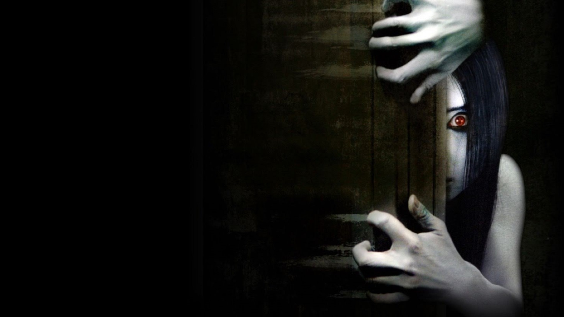
Our main character- Robyn- posed a strong link to 'the grudge' from the film titled Ju-Un: the grudge. This already stood as a huge link because both our film and this Japanese horror are named after the key antagonist. The grudge is a key character who is a young girl, with her only role in the film being dead and following her Resurrection much like our character Robyn. Jason Behr is one of The Grudges star actors after his well known role in Dawson's creek and Buffy the vampire slayer and we would intend to use similar actors to Behr for our own movie originating from televised series creating the more independent film appeal rather than better known Hollywood actors causing a higher intended budget and less realism to the film. The link to the grudge had huge influence and inspiration on our film because both had very similar characterised main antagonists, in addition to this themes of vengeance from the antagonists and similar warped distorted soundtracks were evident in both the grudge and our own movie.

On the left hand side of the image are screen captures from two significant parts of our movie opening where Robyn appears strikingly and captures the audience attention hence why we chose to compare these images. although there are lots of physical similarities with character appearance, the main difference with both films is the plot because the grudge revolves around a curse being passed on whereas our film revolves around a girls gruesome quest for vengeance.  In the images, physically the feminine grudge characters in both films appear similar regarding mise en scene with their white night dresses connoting purity possibly innocence or vulnerability however; in comparison the two close ups above show how they appear as a threat and how the impact they intend to have on the audience is negative.

in the image to the right, I depicted other similar movies we can relate our main character Robyn to. Firstly and most evidently, in the Steven king horror rendition Carrie- Robyn shares many similarities with this antagonist because of her youthful blonde young representation...creating a representation of the younger female social group as young and uncontrollable because she cannot control her power much like we can assume Robyn cannot control her actions. Another similar film is the exorcist where once again a young female protagonist is used as the scary and main point of the storyline. In the exorcist, themes of religion and exorcism surround the young girl bringing in audience social groups concerned with religion or enjoying the complex religious theme....which is a target or aspect of our own film we could work on to involve deeper meaning, themes and social group inclusion in our film. The last film we could use as a similarity and representation of social groups similar to our own film is the film Annabelle where a puppet creation of a young girl is used to scare audiences. Although our film is different to this by using a real main acting character unlike a puppet..one key similarity again is the representation of young social groups with the young looking puppet which is interesting because puppets are typically old and antique attributes making the presence of a puppet even more chilling to include in a horror movie. The pictures I included screen grabs from in the image on the right all show close ups included in our own movie and hit blockbuster horrors and the camera technique of these deep focus close ups is similar and effective to create jump scares and very visual shots for the audience that will stick in their minds.


in our film Robyn is given the most prevalence making us, as the audience, notice her more however this is often different in other horrors where they only appear at unexpected times to scare the audience a lot more as recognised in The Grudge. Although in JU-UN: the grudge, the grudge herself is the main character...she does not always have prevalence or the final shot in the scenes because there are other character storylines regarded more importantly and she remains a constant enigma. We feel like both characters could appeal to a wide audience and particular social groups. For example, the female audience would be engaged by this and may feel like they could relate and sympathise for them much more with being the same gender, in addition to this both female grudge like girls are like evil female doppelgangers and their female attributes like both of the characters having long draping hair, and girly nighties would attract a female audience whilst In contrast the male audience may be interested  too in both movies as it is often found that in horror, younger characters are shown to be at more of a threat and therefore those who enjoy this type of horror would be influenced to watch it.

Similarly, both films follow the conventions of a horror location. In our film, the location is in a quiet and derelict area with nothing around which has more of an eerie feel to it and The Grudge is primarily set in a house which is supposedly haunted with no surrounding industry or residence creating also an eerie lonely feel. We felt both movies could in a horror perspective affect social groups and audiences in different ways. For example, social groups that spend a lot of time at home or feel safe in their home environment would feel uneasy by the setting of a house in the grudge, and this may scare the typical 'sofa audiences' more who watch movies on integrated media platforms like Netflix...contrasting, our film would affect social groups that have a fear of the unknown because our location was designated purposely to feel unknown and derelict.  


typical audiences for horrors and thrillers generally tend to expect there to be a vulnerable advantage taken girl, as girls are stereo typically seen as the weaker sex. for this reason we went against typical stereotypical representations of social groups as The females in both films were harrowing, feared and strong rather than vulnerable.- as well as both being main characters. the actor that plays Robyn for our movie has blonde hair, which is stereo typically seen as attractive..sometimes a representation in social stereotypes of the 'dumb blonde' but can also be a direct connotation of wealth and beauty...however we wanted our film also to completely juxtapose this social group representation creating a scary character out of something beautiful.


audience response to our movie opening

after presenting our film to the class, we retrieved audience feedback from individuals at similar ages to the age range we wish to target our movie at- between 16-18 year olds..however to create a more valuable audience feedback profile we also aim to reach out to proposed audiences of p to 25 years old. Feedback from this particular group of people was especially valuable because fellow media studies co workers gave acknowledgeable and innovative feedback covering key areas of the cinematic industry so the feedback we reviewed was more professional than perhaps a trial audience of viewers that have little knowledge on the background of film and the variations of categories and components required when creating a film. The responses we received from fellow media studies students watching our film opening were generally positive and focoused on effective camera work and sound usage, whilst negative feedback was very sparse.

Referring to sound, the first audience member said she 'liked' the way 'the music in the car overlapped' with our background soundtrack which we thought too was a key strength of our movie because using the technology of adobe premier elements we managed to overlap manylayers of sound to create the most effective and conventional backing sound for our movie opening. the second audience comment too was about sound with the 'thud sound effects' we used at the end of the movie, which we were also pleased was noted as we tried to build up these 'thud' sounds throuhgougt the opening to create tension in the movie as intensity and volume increased.

referring to mise en scene another comment revcieved was about the antagonists 'white gown' which made the 'blood stand out more' which was a key factor relative to costume categorised in mise en scene because we aimed for the girls outfit to seem eeire and juxtaposing to her sorroundings and state...so that the girls gown contrasted with anything normaland natural. purposely we used the colour white for the gown which was commented on becauysethere is more of a stark contrast with the idea and connotations of purity, innocence and freedom and peace associared with the colour white makingthe stark red blood stand out even more. Ensuring the blood on the antagonist 'stood out' was a key cpnsdieration when filming because as said by another audience member the makeup and blood effects were a key conventional factor in keeping our movie at its horror level.

when in the movie making process, we took considerable risks such as using jump cuts even in the first two minuites, and attempting to use the reverse tool to make the girls movements more uneasy. we also used ellipsis to cut certain parts of the movies opening so the audience are left to presume what happens next; for example when the car drives away. We were glad to hear that there was no audience criticism about any of the jump cutting or ellipsis risks we took with our camera editing and filming, only positive feedback and the comment that the way our shots flowed and how we created uneasy movements of the antagonist was 'smart'.

a comment from an audience member relating to sound was the usage of the creepy childish music used at the end, however although we were pleased with this feedback we feel we could have impressed our audience more if this was our own created rendition so our movies soundtrack was more authentic and original rather than using a online track. We feel that this would possibly be a future target for us to introduce the foley process into our movies soundboard and create independently our own soundtrack.

One key piece of criticism from our audience panel was the lack/low volume of sound in the beginning which probably created a more dull atmosphere for the audience and not automantially engulfed the audience member in the film and its storyline. We feel this is constructive criticism that we could work with as a target to improve any future movie openings we create. Also, as said in one of maslows needs- the need to escape from daily troubles and woes would have been more effective if there was a more evident idea of escapism through our film through a realistic and enthralling soundtrack right from the beginning. Another piece of audience criticism to our film was relative to mise en scene and using more low key lighting. once again this criticism was taken constructively and we understood that we could have appealed more to the exact conventions of the horror genre by ensuring the movie was filmed in mainly darkness. However, although we initially aimed to create a dark an eerie atmosphere with dark and low key lighting, this proved a harsh barrier for us because it meant we would have to film outside in dusk when the light is very variable and changes very quickly. Also, filming the opening two minuites to any movie in darkness can be a huge risk because the opening of a film especially the opening two minuits is when you want to give away enigmas or make a clear and concise opening, which the dark can prove a difficulty because certain themes or plots may not be entirely clear to audiecees.

after reciving feedback from the younger age category for our movie opening with fellow media students, we asked for brief feedback from some older up to 25 year olds to reach out the adutuoanl sub age category for our movie. a fewof their comments are depicted below:
' there was lots of sound...fitting sound throughout which made you feel pretty involved'
'its great I escpiecially liked the font for the title'
'the part where the girl opens her eyes is good.....it made me jump and that's what horror movies have to do!'

Tuesday, 22 March 2016

EVALUATION ACTIVITY 4 Who would be the audience for your media product?


We thought that the best market to target and potentially distribute our film to would be 15-year old's in the adolescence to early adulthood age bracket. This gave us quite a wide interval to aim our film at and consider themes that this age range would see as interesting and relevant. typically horror movies like nightmare on elm street, cabin in the woods and strangers are aimed at 15-25 year old young couples that enjoy experimenting with new emotions and feelings hence horror movies can trigger all sorts of emotions and fear. going to see a horror at a cinema or having a horror movie night is a cliche and typical idea for an event or outing hence this is the perfect genre for young social groups and individuals looking for a thrill. Also horrors are one of the best genres for exploiting CGI and special effects that animate nightmares and monstrous creations hence the young and new generations would be interested in watching this genre of film especially if new and modern technology acts as a USP for the film.

as depicted in our image shown above, we wanted our specific targeted audience to be interested in movies that are permeated by a initiative unique and complex story line because we wanted our horror to focus on the plot of the movie and its complexity rather than gore, acting and camera work which tend to be the points that horrors usually revolve around. The young adults pictured above seem to have a high intellect, and are not just wanting to watch our horror for a 'cheap scare' but moreover interested in the movie for its plot and plot twists. Our film in particular has an intense intended plot with the resurrected girls vengeance and experience of the afterlife and we wanted to aim for our audience to build a relation with the characters involved in the movie whether antagonist or not,hence the intended audience for our product would be interested in a high paced intense cinematic experience,

the taste of our intended audience would generally be doing things that social groups can have involvement in, this age range rarely has specific taste because adolescence is all about trying and doing new things, and having a movie specific taste limits the amount and groups of friends you m,ay see a movie with and also limits new and eccentric experiences. This specific audience would tend to shop in mainstream places...however young adults tend to start finding their individuality and what defines them more...this is why we would want to include a broad range of charachters in the full movie that audience members may relate to, and aswell as this go against the mainstream flow with mainstream shops and mainstream outings, and promote our film as inventive and different. Music an audience of this type from 15-25 years old would hugely range, but if we were to include a soundtrack for the full movie, warping and making new interchanged renditions of well known songs would create a huge appeal and relation to the movie. An audinece member from our specific audience would possibly have a favourite TV programme that is a series or ongoing storyline programme such as game of thrones, american horror story or bates motel; with this taken into account we would want our movie to be suspectable to sequels that would haul in a long lasting fanbase for the movie.

Monday, 21 March 2016

Feedback for Evaluation Process

Hollie, think carefully about what you are commenting on in the evaluation process - refer to choices and outcomes in your editing clearly and explore the intended effects you were aiming for by considering the questions below:
 
What did you do? Explain a transition or effect you opted for in the editing process.  What effect did you achieve?  Explain how the choice you made was intended to make the target audience think or feel.  How does this show progression in your use of skills? Explain how this is better than your AS production's outcomes by linking to what you did in your portfolio last year.

These choices are really important for you to reflect on to show you fully understand how you have developed your skills - and make sure you evaluate the comments made by the test audience (the class) using specialist terminology.

We do not have long until the deadline, Easter Monday, for this final stage of your portfolio - so make sure you are pushing yourself and achieving the marks your efforts this year deserve!

Tuesday, 15 March 2016

EVALUATION TASK ONE

In what ways does your media product,develop or challenge forms and conventions of real media products? (ie film openings)


Title (font and style)
Image result for You're Nextwe decided to call our film ROBYN but alter the lettering so it fitted more with twisted and warped horror conventions (RoByN). The idea of using the antagonists name for the title linked to other horrors like Annabelle and the grudge which we thought had instant enigma because audiences would want to find out who this name/title is for. The font we choose is depicted in the top left hand corner of the image above; and had the titled font name of diedie. we thought the font in particular was effective as it appeared grungy and gritty- whilst the style made it look almost scratched into the screen and in particular the white coloring made it appear as if it was chalk which had connotations of old and haunting historical meanings. Also the white was particularly contrasting with the black background which made it appear highlighted and prominent. The style develops conventions of other media products with the etched un-clean font.
Location
the location depicted in the middle top picture above challenged conventions of typical horrors which tend to begin in darkness or the night as nigh time is connoted with evil on goings because our movie begins when there is still a low light as it was filmed in the late afternoon. movies that start in the darkness could be examples such as the exorcist, the strangers or many zombie movies. Also the dark makes it easier to hide and create jump scares which are key conventions of horror movies however effectively we still managed to use these when the external lighting darkened outside when the man was in his car and we created a jump scare with the girl hitting his window. Also, an alternate media product our movie opening can be compared to is music video media- in particular the music video for sound of silence which has a very dark derelict location different to the bright realism of our movie (picture to the
left).
story & opening set up for the story line

our story line is unique in comparison with other similar horrors as we wanted to use an original idea rather than base our film from the inspiration of a conventional and typical horror. Just like for robot overlords the unique selling point was the idea that it revolved around a completely new and original idea we wanted our film to be the same and not follow typical story line plots for horrors. The opening set up with a car challenged other horror based media products because in other films especially horrors cars are usually abandoned and do not have a driver that excavates the car as the antagonist did in our movie. Other media products we thought our movie opening developed on was somne of the televised adverts and warnings against drink driving because although eccentric and unrealisitc our movie in a way did develop on drink driving warnings.
costume/props
we wanted our costume and props to stand out from other similar horror movies because mise en scene plays a huge role in how scary or memorable a horror is and for this reason we didn't want to follow typical costume conventions and props in horrors being weaponry, dangerous attributes and scary mechanisms; instead we used a car which we thought would enable us to show how real, typical and everyday things can form foundations for a horror experience. Many horrors set in the past also wouldn't include a car as a main prop which creates a stand out appeal for our movie. the costume for the man was fairly typical and developed on conventions of bandits and antagonists in thrillers and horrors which tends to always be dark covered clothing which we wanted to directly connote he has a bad/immoral side much like many horror characters that have a fatal flaw...e.g. the male clumsiness in cabin in the woods, the inability to complete tasks in SAW. we wanted our primary focus to be on the young girl in the movie hence we worked more with her makeup and costume to ensure she looked chilling and ghoulish. Her costume in white nightdress fitted with conventions from other popular horrors like the grudge, Annabelle, orphan which all use the old fashioned costume to warp time periods together. we developed on the conventions of using dark scarlet blood in our movie to make it look realistic and analysed other horrors which we found dealt with gore realistically to create the best injures and realism..for example SAW and Shaun of the dead.
camera work and editing
camera work was one of the key aspects of our filming process where we wanted to be inspired by other movies because we wanted to develop on their technique to create realism in our piece. one of the most effective editing techniques we developed on was the technique of making the grudge girl in the film the grudge appear as if she was moving in un coordinated backwards uneasy movements...by developing on this we enabled ourselves to make our own films antagonist too appear as if she was moving like this...especially when the eye line match show looks upon her hand and when she was walking behind the car. our film also develops conventions of other similar media products which use lots of different camera techniques and effective editing techniques to draw an audience into the film immediately- for example action films like fast and furious create lots of high paced action in their opening two minutes to draw audiences in however we challenged this by attempting to create high paced drama in a horror in stead of an action movie. 

genre and how the opening suggests it & how characters are introduced
the opening challenges typical horror openings because usually horrors use the technique of including flash backs or time lapse periods to create the foundations for a story, rather than beginning it as we did by starting the story immediately. Usually in other similar horror genre movies the genre is hinted by predominantly the lighting as horror based experiences tend to occur in darkness and shadowed environments however our film challenged this by using light (natural lighting) to begin the film. films like drag me to hell and the exorcist begin in darkness. We did adopt and develop on film producing methods of similar horrors with our sound because we wanted high paced synthetic tension building sounds much like most horrors have and even include a sound motif just like JAWS has.


special effects
often the special effects in horror movies and other horror media products like televised programmes advertisements and gaming include heavy gore special effects and we didn't want the special effects in our movie to be the key prominent aspect of it; instead we wanted the story line itself to make our movie stand out the most. we tried to adopt some of the special effects used in gaming like the subtle makeup of characters to make them stand out as dirty or bloody or wound stricken however we wanted to challenge other media forms by not having too much gore.